
Getting Started
Environment Setup
Software Environment
IDE Integrated Development Environment (hereinafter referred to as IDE) is an integrated tool for controlling project development. It is recommended to run the environment:
- Win10 operating system
- Memory 2G or more.
Tip: There are many function windows in the software. For a better experience, it is recommended to work on a computer with a screen resolution of 1920×1080 or above, and set the zoom ratio to 100%. If you adjust to other scaling, some windows of the software may not be displayed properly.
Central Controller and Connections
The default factory IP of the device is set to 192.168.0.101. When using it for the first time, it can be modified by entering the WEB configuration page through the central controller network settings or directly connecting the computer to the central controller.
After obtaining the IP address of the central controller, if you need to adjust the IP settings or other initialization settings of the central controller, you can visit the WEB configuration page of the central controller. For example, if the central controller IP is 192.168.0.101, the WEB access URL is http://192.168.0.101/home, and the initial password is admin.
Quick Start
Using IDE for control system development typically follows the following overall steps:
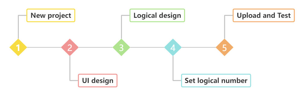
As shown in the figure, steps 2–5 may be modified repeatedly in the actual project development process, as follows:
- New Project: Follow the instructions for New Project to establish your project.
- UI Design: Use the UI Designer to design the control interface. For details, please refer to UI Design.
- Logic Configuration: Design logic modules on the logic canvas. For details, please refer to Logic Configuration. UI Design and logic configuration can be adjusted by engineers.
- Set Logical Number: Set action logical number and attribute logical number in the component or page attribute bar, and associate with logical modules such as UI interaction, setting UI attributes, and outputting UI attributes.
- Upload and Test Project: After the preliminary design of the project is completed, upload the project to the central controller (referred to as: controller) for testing and verification according to the instructions in Upload Project.
IDE Functions Introduction
Engineers can quickly create user interfaces through the IDE integrated development environment (hereinafter referred to as IDE), without writing code, only through logic module wiring, you can connect controlled devices (referred to as peripherals). The IDE can also parse peripheral instructions through the relevant logic modules to ensure that the peripheral and component states are updated synchronously. In order to improve development efficiency, IDE supports copying and pasting UI components and logic modules across projects, greatly simplifying the project development process and achieving an efficient and convenient development experience.
Menu
The menu includes the basic management of the project, as shown in the figure below:
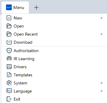
Specific functions include:
New · Open · Open Recently · Download · Export Project Packages · Save As · Authorization · IR Learning · System · Language · Exit.
New
- Click the menu icon, and select [New] – [Project] from the drop-down menu.
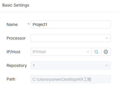
- Set the project-related information in the window opened by the IDE, shown in the figure below:
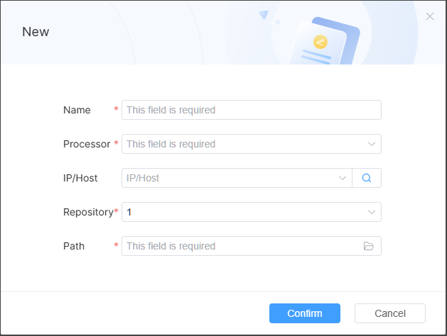
Attributes marked with red star are required. The path represents the local path where the new project will be stored.
Note: Up to 5 projects can be opened simultaneously. When the number of opened projects exceeds this limit, new projects cannot be created. You need to close one project before creating a new project.
Open
IDE has no default open projects. You can access recently opened projects by clicking on History in the initial screen. You can also select another project file by clicking on [Open].
- Directly click [Open] in the initial interface, or you can click the menu icon to select [Open] from the drop-down menu.
- Find the file path of the saved project, select the file name in *.ea format in the project directory, and click Open.
Open Recently
Click the menu icon, and move the cursor to [Open Recently]. The IDE displays up to 5 recently used projects.
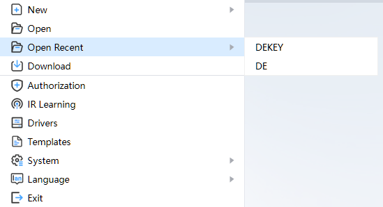
The red box shows a recently accessed project file. Clicking this line will open the corresponding project.
Download
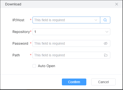
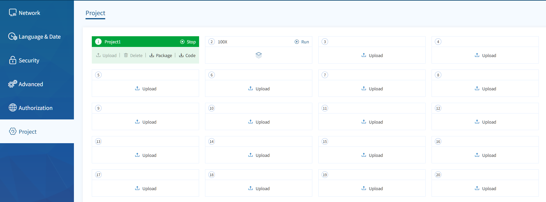
Engineers can upload edited engineering files to the controller. If necessary, engineers can also download engineering files from the controller.
- Click the menu icon, and select [Download] from the drop-down menu.
- Click the search icon — IDE will search for accessible controllers within the current local area network. After the search is complete, the drop-down box will display the IP address of the controller from which you can select. The IP address of the controller can also be entered manually.
- Enter the controller access code.
- Select or enter the project library number to download.
- Specifies the location path of the project to be downloaded. Click [OK] to download. After downloading, the project file will be stored in the specified location in the form of *.zip compressed package. If [Auto Open] is checked, the compressed package will be decompressed to the selected directory and automatically opened.
Export Project Package
- Click the menu icon, and select [Export] from the drop-down menu. Projects with incorrect entries will not be downloaded.
- Select the path in the folder selection window, click [Select Folder] to export the project package, and the exported project package suffix is eap.
- Upload the project package in the central control management background.
Save As
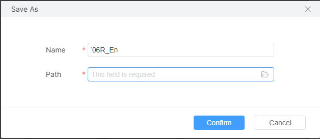
- Click the menu icon, and select [Save As] from the drop-down menu.
- Enter the project name to be saved as and the save path in the window, and click [OK] to save.
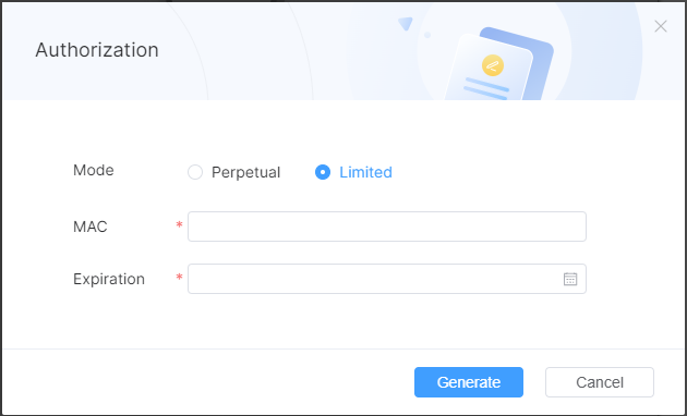
Authorization
- Click the menu icon, and select [Authorization] from the drop-down menu.
- Select Authorization Module in the window. You do not need to select an authorization expiration date when you select permanent authorization; you need to select an authorization expiration date when you select limited authorization.
- Enter the MAC address of the controller to be authorized, and click [Generation] to generate the authorization code.
- When the authorization expires, enter http://controllerIP/unlock in the APP interface or browser to enter the authorization code.
IR Learning
Click the menu icon, and select [IR Learning] from the drop-down menu.
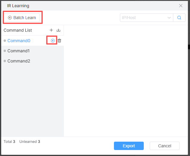
Click the add icon to create the infrared command that needs to be learned. Select the IP address of the infrared learning controller through the device drop-down. Click Batch Learn or the learn icon to start learning.
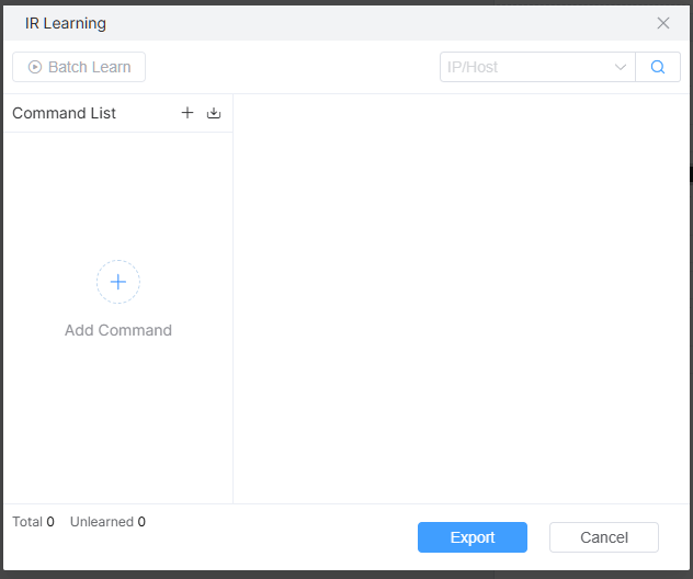
Supports directly entering the CCF code in the input box on the right. After learning is completed, click Export for use in commands.
System
Click the menu icon, and move the cursor to [System] to display the content related to [System].
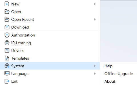
The system mainly includes 3 parts: [Help], [Offline Upgrade], [About]. [Help] can be clicked to view the help documentation; [Offline Upgrade] is used to select higher version offline package to upgrade IDE; [About] displays IDE registration information.
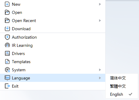
Language
Click the menu icon, and move the cursor to [Language] to switch the interface display language.
Exit
Click the close icon in the upper right corner of the project tab to save and close the corresponding project. Click the close icon in the upper right corner of the IDE to save and exit the IDE. Click the menu icon, and select [Exit] from the drop-down menu to save and exit the IDE.
Tool Bar
It contains functions such as saving and uploading projects. Specific functions include: Save, Preview, Debug, Upload, Console.
Save
Clicking the save icon in the toolbar will save all the contents of the project currently in the active state.
During saving, if there are warning items and error items, it can also be saved normally. You can view warning items and error items in the problem list.
Preview
Click the preview icon in the toolbar to preview the design interface opened by the current project. Preview the page or window opened by the current project. Subpages cannot be previewed directly. It supports component interface operations, such as buttons, switches, sliders and other interface operations. Communication with peripherals is not supported.
Debug
Click the debug icon to upload the project and enter debug mode. The logs and execution logic will be displayed in the debug popup window.
Upload
Click the upload icon in the toolbar to upload the current open project. Before uploading, the IDE saves the project. Please refer to Save. If there are no error items, IDE will upload the current compilation package to the controller according to the project configuration information, and the relevant printing information will be output to the [Console] window of IDE console when the project is running; users can connect to the central control screen or user APP to operate, and engineers can download the project file through the [Download Project] function of IDE.
Console
When uploading a project, the system automatically opens the console. You can also switch manually by clicking on the toolbar console icon.
After opening the console, the console is displayed under the IDE and automatically connected to the controller configured by the project, as shown in the figure:
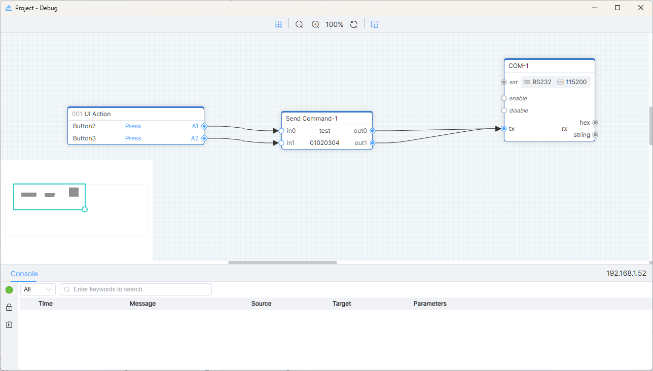
Log area outputs necessary information in real time, such as project upload, load log, and logic module sending and receiving data during operation. Error messages are shown in red, warning messages in yellow, and normal messages in black.
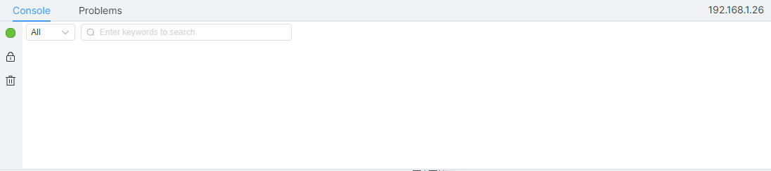
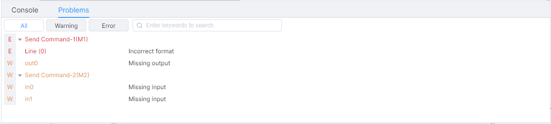
The problem list displays error items and warning items in logical configuration in turn. You cannot upload project and export project package when project has error item.
Double-click the error or warning prompt, and the IDE will jump to the relevant logic module to help engineers quickly locate the error.
Basic Setting
Project name, device model, IP/Host, project library and path are displayed in project configuration. The path cannot be modified.
IP/Host can be entered, or you can select the IP searched in the drop-down box. Click the link icon to enter the controller background management page corresponding to the currently selected IP/Host.
UI Design
The UI design is divided into regions for functional description, as shown in the figure:
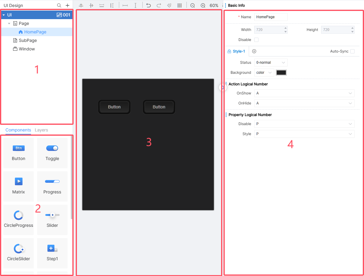
① [User Interface] area; ② [Component] area; ③ UI Design area; ④ Interface/Component attribute setting area.
UI Designer is the core module of UI Design, including the addition of interfaces and components, style design, interface layout and other functions. This chapter will introduce them one by one.
The software provides WYSIWYG UI Designer, real-time rendering, flexible property settings and layout functions. After the user creates a normal page, sub-page and window, he/she can drag the required UI component to the page, and adjust the display effect by modifying the parameters of the UI component. By setting action logic number and attribute logic number, it is associated with UI related logic module.
Tool Bar
In the window of [UI Design], the toolbar mainly contains function icons such as alignment, format brush, grid, etc. Component alignment (refer to Quick Alignment), spacing adjustment, formatting brush, grid and zoom in and out can assist engineers in rapid layout and typesetting of components in the interface.
Fast Allocation
Click the fast allocation icon in the toolbar to enter the batch allocation logical number mode.
In the allocation logical number window, the starting number defaults to the current maximum action logical number or attribute logical number +1. For example, if the current maximum number is 5, the starting number in the window is 6. As shown in the figure:
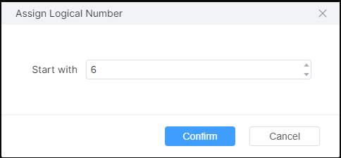
Click on the corresponding component to complete the logical number assignment.
Display Logical Number
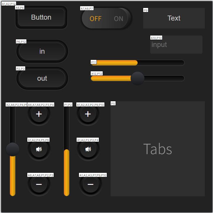
Click the display icon in the toolbar to enter the display logic number mode. The upper left corner of the component will display the assigned action logic number and attribute logic number. As shown in the figure:
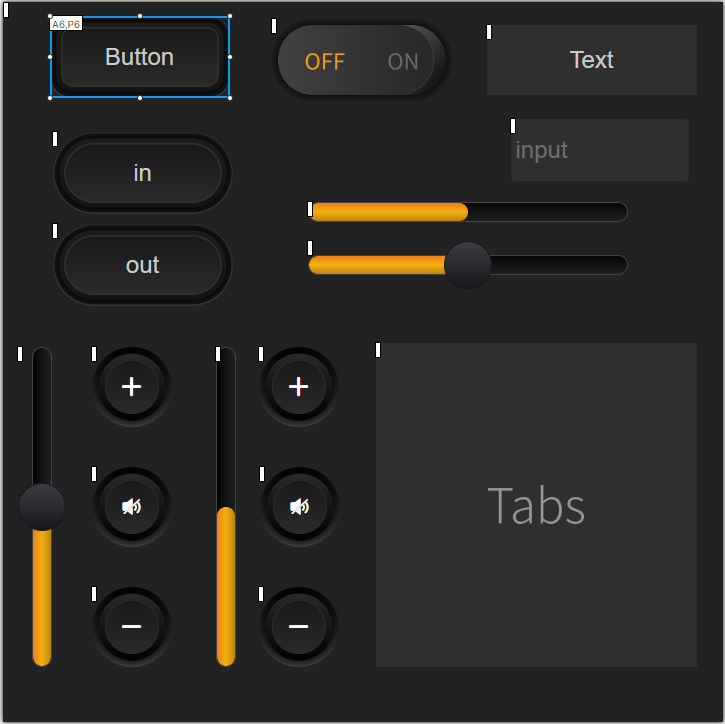
Click the icon again to exit the display mode.
Search Logical Number
Engineers can search the logical number to find the page where the corresponding component is located. The specific operation steps are as follows:
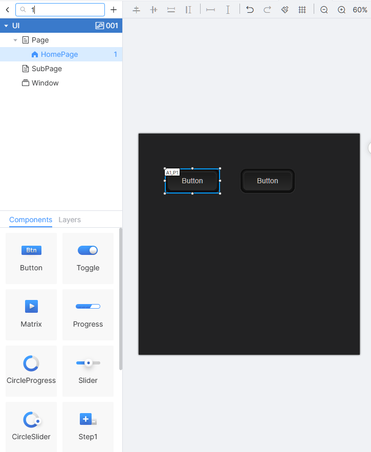
Click the search icon, and enter the logical number of the component or page you want to find in the search box to search. This search method uses fuzzy matching mechanism.
The page node will display the matching quantity of the corresponding page, and the upper left corner of the matched component in the page will display the corresponding action logical number and attribute logical number. Clear the search box, then automatically exit the search.
Page
Right-click the corresponding tab of [UI Design] to open the menu. You can select [New Page], [New Subpage], [New Window], as shown in the figures below:
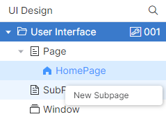
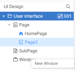
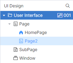
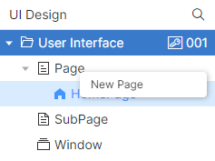
Pages are divided into three types: normal pages, sub-pages and windows. IDE will put different types of pages under the corresponding page nodes. Among them, the size of ordinary pages is determined by the model of controller configured by engineers. For example, after PT-CON-TP40-HD is selected as the device model in project, the size of all ordinary pages is 720×720; the size of sub-pages and windows needs to be defined by engineers.
Please note that subpages are different from normal pages/windows, and can only be displayed through subpage containers. Subpages can be embedded into two other types of pages through subpage containers.
The jump function of the page will be described in Button.
Page
Click [New Page], enter the page name in the window of New Page, and click [OK] to create it. The new page is saved under the [Page] node of [User Interface]. As shown in the figure:
When creating a project, IDE will automatically create the home page. If you want to set other pages as the home page, right-click on the page and select [Set Homepage] to set the current page as the home page. Only normal pages can be set as the home page, and is unique.
Double-click a page, the IDE UI Design area displays the corresponding page, and the right side displays the properties of the page. As shown in the figure:
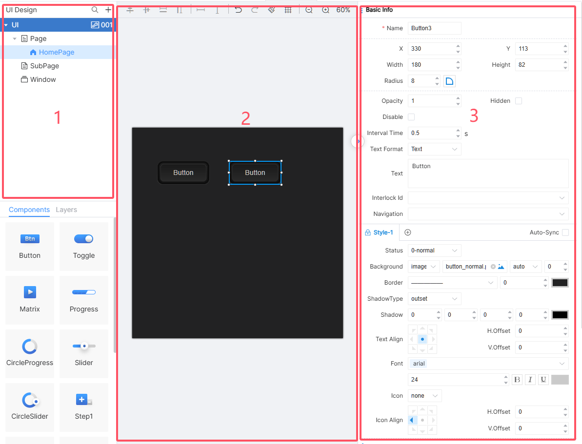
Double-click the page in ①, perform page layout operation in ② area, and perform relevant attribute setting in ③ area. Page attributes include name (required), width (read-only), height (read-only), disable, style, action logical number, attribute logical number. The names of normal pages, subpages and windows cannot be repeated, and the names of components can be repeated.
Note: If the engineer selects the component in the current page, the attributes of the selected component are displayed in the area ③. To edit the page attributes, click the page area or blank space.
Subpage
Right-click the page navigation area and click [New Subpage] in the menu. The IDE will pop up a new subpage window:
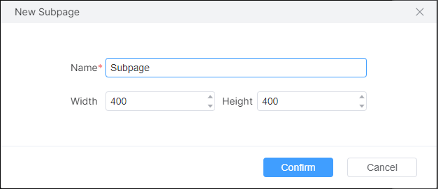
Enter the name, width and height and click [OK] to find the subpage under the [Subpage] node in the page navigation area. At this time, relevant configurations can be modified in the attribute editing area, and the attributes are editable, which is the same as that of ordinary pages.
During page preview and project operation, subpages need to be displayed through subpage containers, that is, different subpages can be switched and displayed by controlling the display interface properties of subpage containers.
Note: The size of the subpage needs to be consistent with the size of the container area in which it is displayed, otherwise scroll bars may appear to affect the visual experience or only part of the content may be displayed.
Window
Windows are usually used primarily for informational purposes. Right-click the navigation area of the page and click [New Window] in the menu. The IDE will pop up a new window:
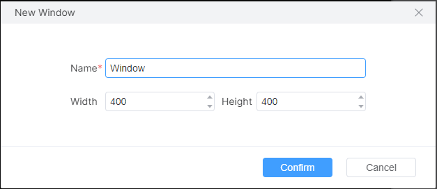
Currently IDE does not support pop-up position settings, the default pop-up position in the center of the screen. Its properties are set the same as normal pages.
Delete pages
Click the right mouse button on the page in the page navigation area and select [Delete] from the menu to delete the page, and the deletion operation cannot be undone.
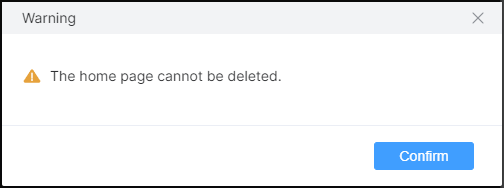
Note: The home page cannot be deleted.
Component
Component
UI component is an important part of user UI Design. The attribute settings of pages and components determine the layout and style of UI interface. Combined with the action logic number and attribute logic number of components, engineers can design personalized user interface and interaction.
Component contains buttons, switches, matrix, progress, slider bar, step 1, step 2, subpage container, text, input box.
Component Property Settings
Click any component (including the page itself) on the page, and the IDE will display the selected border on the corresponding component, and display the detailed properties of the component on the right side, as shown in the red box area below:
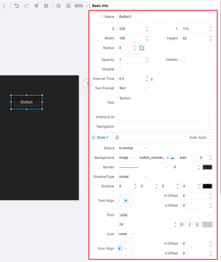
Basic information, style, action logic number and attribute logic number are displayed in the component attribute setting area.
The engineer can click the collapse and expand buttons to hide and restore the attribute setting area respectively when designing the page layout.
Common Property Settings
UI component properties vary according to component type. But each component has a set of common attributes, also known as common properties, whose names and meanings are exactly the same. Details of basic information are shown in the table below:
Radius Settings
The radius at the corner of the component can be set through the fillet property.
By default, when you set the value of this property, each corner of the component appears with a radian corresponding to the set value. Click on the sector icon to the right of this property, and four edit boxes will appear, indicating that you can set the value of one or several fillet radians individually. The four rounded radians of the button can be set independently, as shown in the figure:
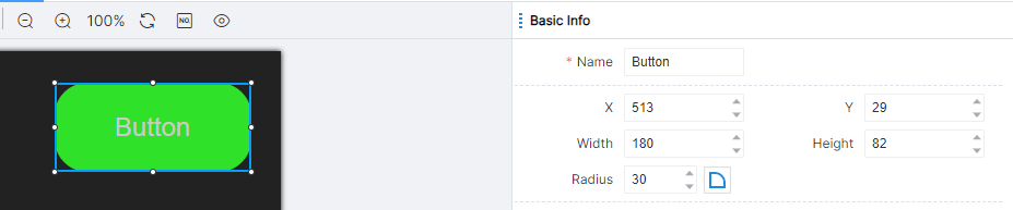
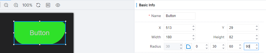
Note: After setting the overall value of the fillet (left side of the sector icon), click on the sector icon to expand the radian value edit box set separately, and set the radian of each angle. At this time, the value set separately shall prevail, and the overall value shall not take effect.
Style Settings
A component can change the style it appears in the interface by adjusting the value of the style property. Components change styles logically in some scenarios. For example, the button component states are normal, activated and disabled, as shown in the figure:
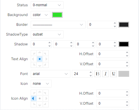
In each state, the component has a separate set of style settings. For different states, engineers need to set up each style separately.
Engineers can click the add icon to add component styles, and click the lock icon to lock the default component styles.
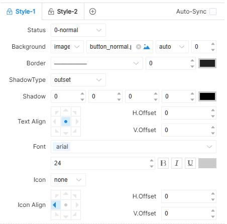
Common style properties are as follows:
Background
The background property can be used to modify the background of a component. In this property, engineers can select a local or online image as the background image for the component:
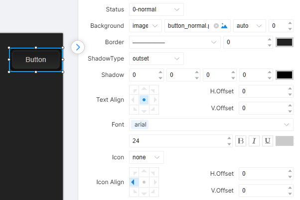
In terms of fill rules for image property, the IDE offers three options: Auto, Hold, and Repeat. Auto means adaptive, that is, the image will be scaled according to the length and width of the component regardless of its size; Hold, that is, the image keeps its own size. If the size of the component does not match the size of the background image, only part of the image or blank space will be left on the background of the component; Repeat means that when the image is small and its size is not enough to occupy the background of the component, the purpose of occupying space is achieved by repeating its own image. At this time, the background of the component is formed by repeatedly splicing the image.
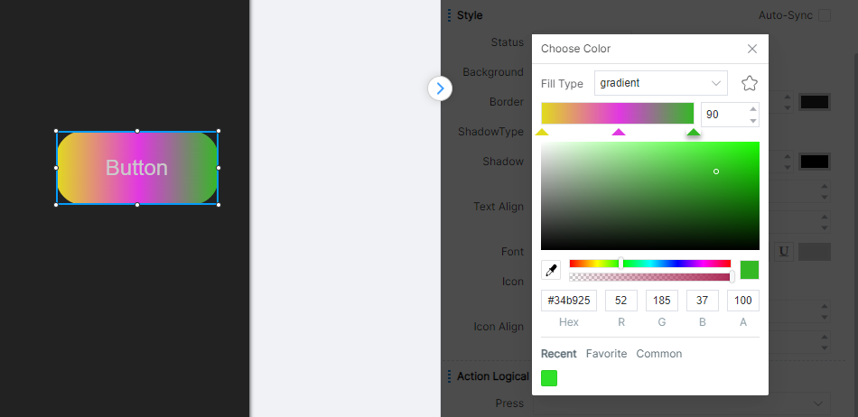
You can also set the background to color, click the color icon on the right, click the open palette to set the background color of the component. The color palette allows you to set the background of components to solid or gradient colors, which can be found in the Color section.
Border
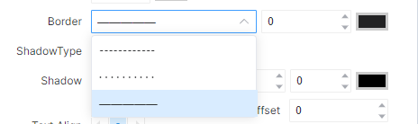
Border properties can be used to modify the style of component border lines, including the types of border lines (dotted line, dot, solid line), width, and color of border lines.
Shadow
Shadow can simulate projection effect for components in actual scenes. Shadow types are divided into outer shadow and inner shadow. Shadow parameters are mainly set from four aspects: position, size, blur and color.
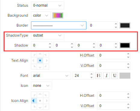
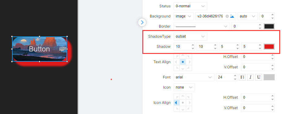
The first and second edit boxes represent the X and Y offsets, respectively. The X offset indicates the horizontal distance of the shadow from the component, with the shadow being positive on the right side and negative on the left; the Y offset indicates the vertical distance of the shadow from the component, with the shadow being positive on the lower side and negative on the upper side. The third edit box indicates the blur level, with lower values indicating sharper shadows and higher values indicating more blurred shadows. The fourth edit box represents the shadow size. A value of 0 means that the shadow is consistent with the original component width and height. If you want to increase the width and height of the shadow, you can increase this value. As shown in the figure:
Text Align
Text alignment adjusts the alignment of text within a component within the component area, as shown in the figure:
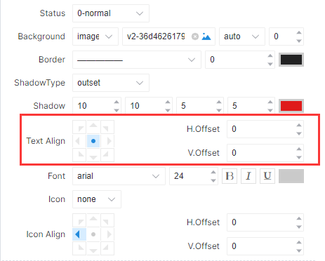
Once the alignment properties are set, you can adjust the position of the text by adjusting the horizontal offset and vertical offset so that the content can be placed anywhere within the component.
Font
For text that appears on various components, you can style it through font properties, as shown in the figure:
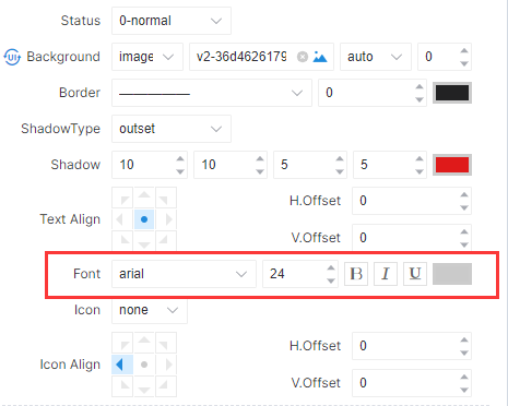
The first drop-down list can set the font, the second edit box can set the font size, B stands for bold, I stands for italics, U stands for underline, and the color block after can call up the palette to set the font color.
Icon
Icon attributes are provided for buttons, switches, matrices, steppings, and text, and none, icon, image, and link can be selected. As shown in the figure:
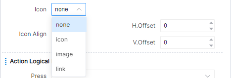
Icon alignment can adjust the alignment direction of icons within the component area, with specific settings referring to text alignment.
Color
During the UI Design process, when color adjustment is required, you can open the color palette by clicking on the icon for setting colors. The icon for setting colors is usually located on the far right side of a property settings bar, as shown in the figure:
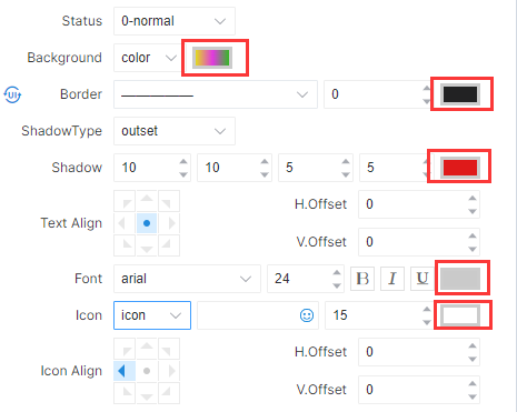
Click on the color setting icon and a color palette will pop up, as shown in the figure:
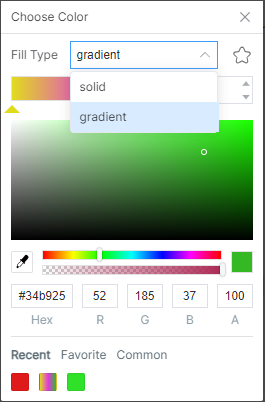
The fill type supports both solid and gradient colors.
Click on solid color, and the entire filled area will be the color selected by the palette. The color range can be selected through the color selection bar under the color palette. Engineers can determine the approximate range of colors through the color selection bar, and then select the specific color they need through the color palette.
Under the color bar is the transparency selection bar. The leftmost end indicates complete transparency, in which states, the color of the component will be consistent with the interface. The far right end represents complete opacity, and the color of the component is completely determined by the color selected in the palette. Any range in the middle of the selection bar represents a certain degree of transparency, and the background color of the component will be determined by both the page's background color and the color selected in the palette.
Click on the gradient color, and a gradient color adjustment tool will appear below the fill type, as shown in the figure:
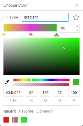
The leftmost position specified by the triangle represents the start, the rightmost represents the end, and at least two colors must be specified to represent the start and end of the color. The middle position can be set with a certain transition color by clicking to bring up (or remove) the triangle symbol, and multiple triangular symbols can be set to make the transition color more rich. The number on the right represents the rotation angle in that direction. By default, the gradient color changes from bottom to top. If set to 90, the direction from bottom to top changes to left to right, as shown in the figure:
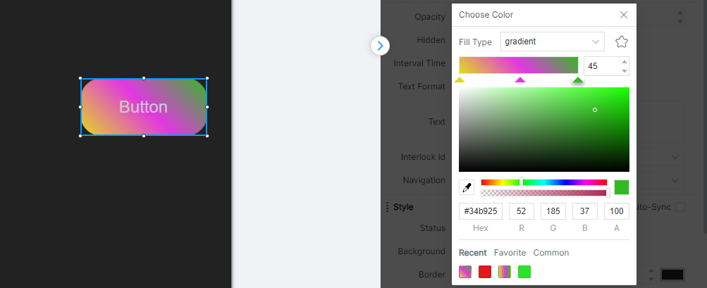
In addition, engineers can also modify colors by directly modifying the values of RGB, where A represents transparency and Hex is the hexadecimal representation of RGB. Each option can be manually edited, but when the edited content is not in compliance or exceeds the reasonable range of that option, this editing will not take effect and its value will be restored to its previous state.
The Recently Used, My Favorite, and Universal Colors below are the colors that engineers have recently used, the Favorite Colors, and the recommended colors provided by the IDE for engineers based on common scenarios, making it convenient for engineers to quickly choose.
Note: Only palettes of some properties can set color fill types, while border lines, fonts, etc. cannot set fill types and only support solid colors.
Action Logic Number
A component can perform subsequent logical operations by setting the logical number of the action to correspond to the logical number in the UI interaction logic module. It can be blank. When no action logic number is set, the component action will not trigger any subsequent logic.
Different components may have different action logic numbers, for example, the button has three action logic numbers: press, long press and release, as shown in the figure:
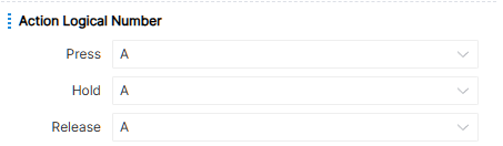
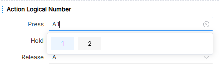
Select the used action logic number through the drop-down box, or manually input the new action logic number, as shown in the figure below for example:
Attribute Logic Number
The component can change the component attribute value or output the current attribute value of the component by setting the attribute logic number corresponding to the logic number in the UI attribute setting and UI attribute output logic module. When the attribute logic number is not set, the attribute value of the component will not be changed by the UI attribute logic module, and will not be output through the UI attribute logic module.
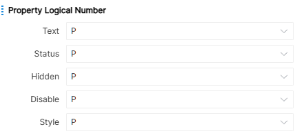
Different components may have different attribute logical numbers, for example, buttons have four attribute logical numbers: text, status, hidden and disabled, as shown in the figure:
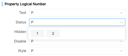
Select the used attribute logical number through the drop-down box, or manually enter the new attribute logical number, as shown in the figure below for example:
Component Details
Most attributes have been described in detail in Component Property Settings. Here, the unique attributes, action logical numbers and attribute logical numbers of each component will be described according to the classification of the component.
Button
All the properties that can be set for the button are shown in the figure:
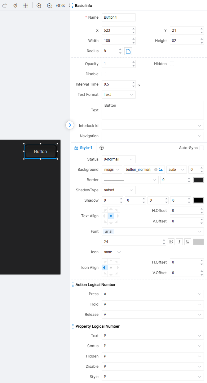
Button supports interlock number setting, a group of buttons can be bound into an interlocking relationship to ensure that in any operation situation, only one button is active at the same time.
Page jump support: page, subpage, window. Trigger page jump when button is released.
The IDE provides three state attributes for button components: 0-General, 1-Active, and 2-Disabled.
Logical numbering of button actions: press, hold, release. The first trigger long press time is fixed at 1 second, and the subsequent ones are executed according to the interval time set by the engineer.
Button attribute logical numbering: Text, Status, Hidden, Disabled, Style.
Toggle
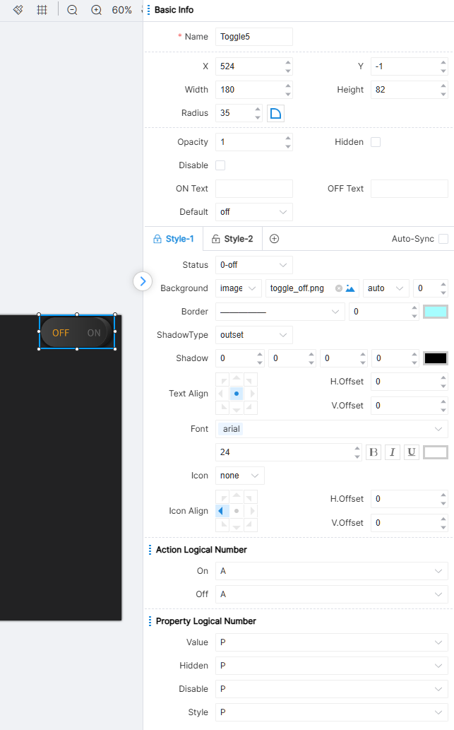
All the properties that can be set by the switch are shown in the figure below:
Toggle-specific attributes include text-on/text-off, which indicate the text displayed on the component when on/off; default value indicates the default state of the component (on or off).
The IDE provides two styles for switch components, Style-1 and Style-2. Each style has three state attributes: 0-off, 1-on, and 2-disable. It should be noted that by setting the UI attribute module to modify the attribute value of the component (default attribute value is configured in the attribute bar), you can cause a state change. Switches cannot control their state directly through logic modules.
Switch action logic number: ON, OFF.
Switch attribute logical numbering: Value, Hidden, Disabled, Style.
Matrix
Matrix is a special component provided for matrix equipment. Only matrix components with the same matrix group number can be configured for corresponding control operations. All properties that can be set for a matrix group are shown in the figure below:
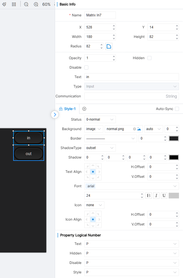
Enter the type matrix, and all the properties that can be set are as shown in the figure:
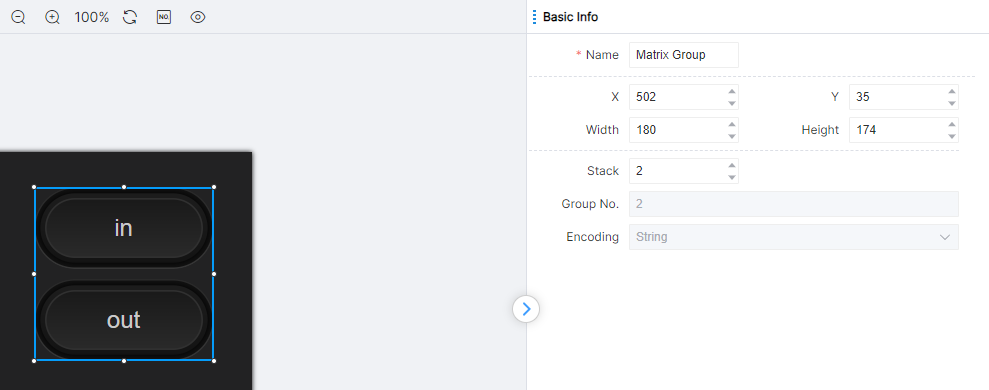
Matrix communication codes are used to control input and output matrices.
The IDE provides three state attributes for matrix components: 0-General, 1-Active, and 2-Disabled.
Matrix has no action logic number.
Matrix attribute logical numbering: Text, Hidden, Disabled, Style.
Output type matrix, all attributes that can be set refer to output type matrix.
Progress
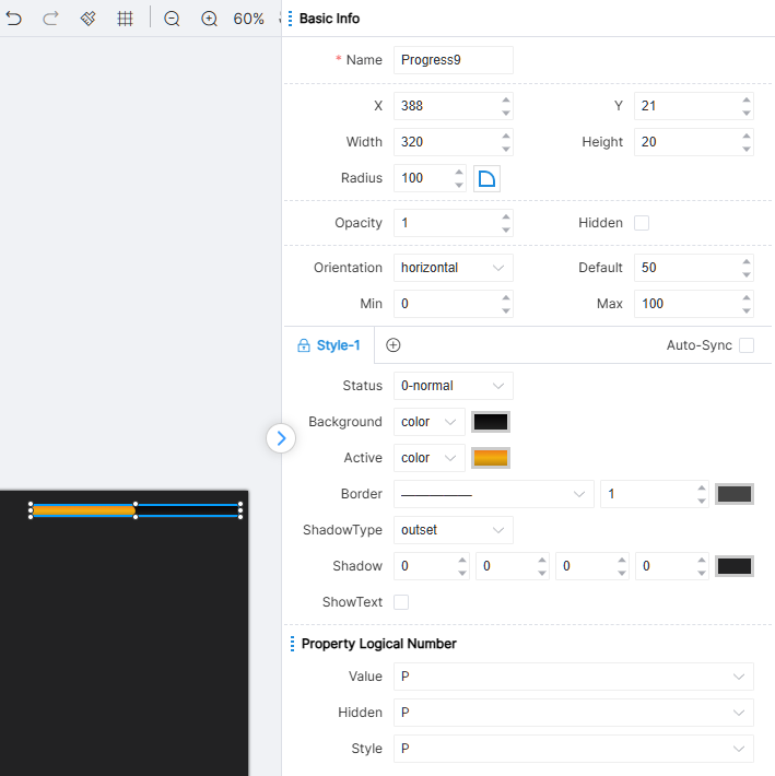
All the properties that can be set in the progress are shown in the figure below:
The direction values of the progress include horizontal, vertical, horizontal flip, and vertical flip, indicating the layout direction of the progress on the page. The default value indicates the position of the active area on the progress in the default state. The minimum and maximum values represent the minimum and maximum values of the progress, respectively.
The IDE provides 0-General, a status attribute for the progress component.
The progress has no action logic number.
Progress attribute logical numbering: Value, Hidden, Style.
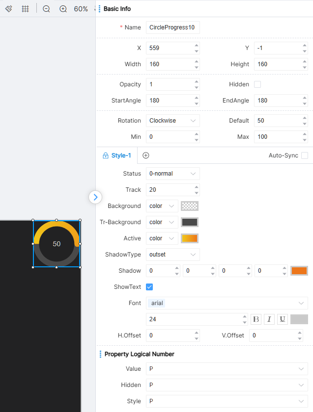
CircleProgress
The properties that can be set for the CircleProgress are shown in the figure:
The rotation direction of the CircleProgress can be either clockwise or counterclockwise, indicating the rotation direction of the progress bar on the page. The default value represents the position of the active area on the progress bar under default conditions. The minimum and maximum values represent the minimum and maximum values of the progress bar, respectively.
In the IDE, the progress bar component provides only one state attribute: 0-normal.
The CircleProgress has no action logical number.
The CircleProgress property logical numbers include: Value, Hidden, Style.
Slider
The slider is divided into two parts structurally: the slide rail and the slider. The properties and styles of these two parts are separated to a certain extent in terms of configuration. All properties that the slider bar can set are as shown in the figure:
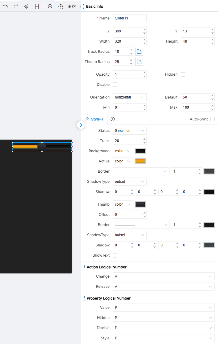
The slider has some of the same attributes as the progress. The difference between them is that the progress is passive. According to the UI attribute setting module, the value of the progress is modified, while the slider bar is the position where the user actively triggers the modification drag button.
When setting the fillet property, it is divided into two property configurations: slide fillet and slider fillet. The specific configuration method is the same as other fillet configurations. In the style properties, the track and the active area are configured separately. Depending on the thumb's position, the track can be divided into two parts: the active part's style is configured through the active area properties, while the inactive part's style is configured through the background properties. In addition, the meanings of direction, default value, minimum value, and maximum value are the same as those of the progress bar.
The IDE provides two status properties for slider components: 0-General and 1-Disabled.
Slide bar action logic number: change, release.
Slider attribute logical numbering: Value, Hidden, Disabled, Style.
CircleSlider
The CircleSlider consists of two parts: the track and the thumb. The properties and styles of these two parts are somewhat separated in configuration. The configurable options are shown in the figure:
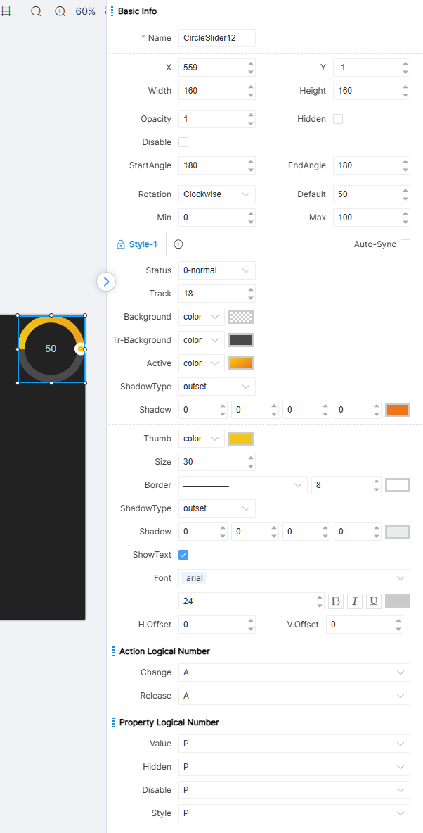
The properties of the CircleSlider and the Progress are partially the same. Difference: the progress bar follows the settings of the UI property module, and its value changes passively; whereas the CircleSlider is actively modified by the user dragging the knob.
In the style properties, the track and the active area are configured separately. Depending on the thumb's position, the track can be divided into two parts: the active part's style is configured through the active area properties, while the inactive part's style is configured through the background properties. In addition, the meanings of direction, default value, minimum value, and maximum value are the same as those of the progress bar.
The IDE provides the CircleSlider component with two state attributes: 0-normal and 1-disable.
CircleSlider action logical number: Change, Release.
CircleSlider property logical number: Value, Hidden, Disable, Style.
Stepping 1
Stepping is used in conjunction with slider bar to increase or decrease the slider value by a fixed value. All the properties that can be set for Stepping 1 are shown in the figure below:
Stepping 1 is composed of 1 progress bar component, 2 stepping components and 1 switch component. The components in Stepping 1 group cannot be deleted or copied separately. All the properties that can be set for stepping are shown in the figure:
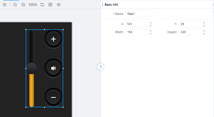
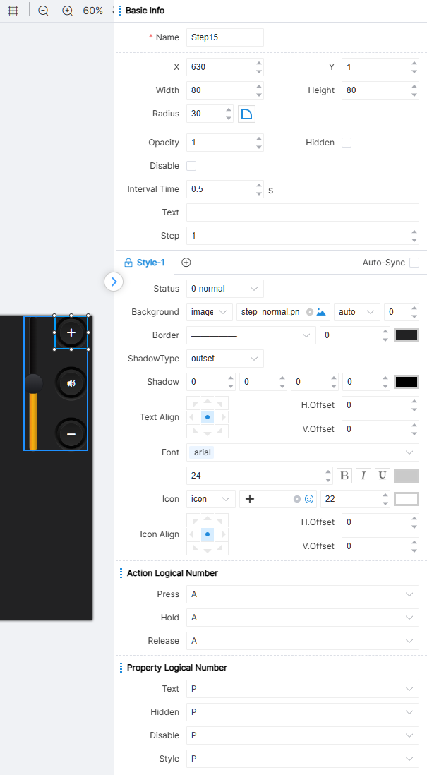
The text content is displayed in the stepping. + can be configured to indicate that the stepping is an increasing value, and − can be configured to indicate that the stepping is a decreasing value. It should be noted that only the displayed text is indicated here. The specific increasing value or decreasing value needs to be entered in the "stepping" field (positive or negative). Stepping indicates how much the stepping increases or decreases with each click (by setting the stepping to a positive or negative number), or it can be triggered multiple times with a long press.
The IDE provides three state properties for the stepping component: 0-Normal, 1-Active, and 2-Disabled.
Stepping action logic numbering: press, hold, release. The first trigger long press time is fixed at 1 second, and the subsequent ones are executed according to the interval time set by the engineer.
Stepping attribute logical numbering: Text, Hidden, Disabled, Style.
Stepping 2
Stepping is used in conjunction with progress bar to increase or decrease the progress bar value by a fixed value. All the properties that can be set for Stepping 2 are shown in the figure below:
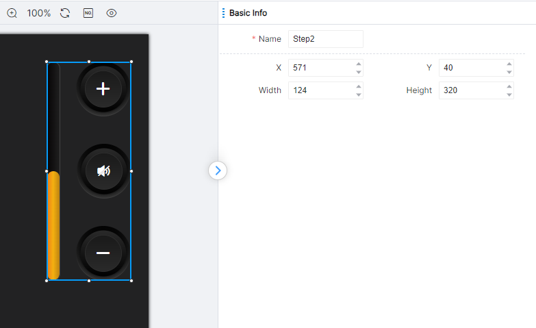
Stepping 2 is composed of 1 progress bar component, 2 stepping components and 1 switch component. The components in Stepping 2 group cannot be deleted or copied separately. For all the properties that can be set for stepping, please refer to the stepping in Stepping 1.
Tabs
All properties that can be set for the subpage container are shown in the figure below:
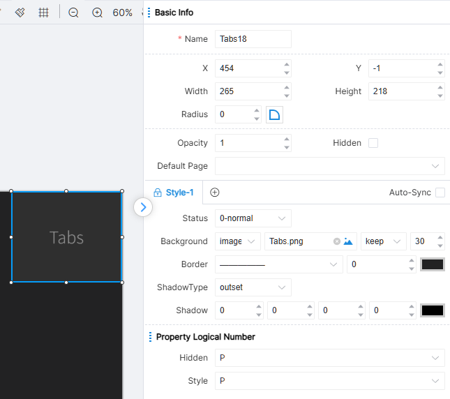
A subpage container loads the contents of a subpage, where the default page represents the subpage that the subpage container displays by default. According to the actual scene, modify the display subpage in the subpage container, so as to achieve the purpose of subpage content replacement. The IDE provides 0-General, a status property for subpage container components.
Subpage container has no action logical number. Engineers can use the page jump property of the button, or use the page jump module to control the subpage container to complete the switching of the display content.
Subpage container attribute logical numbering: Hidden, Style.
Text View
All the properties that text can set are shown in the figure:
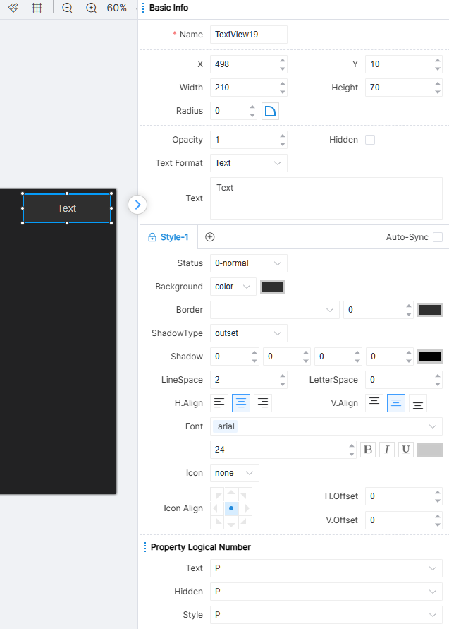
The content in the text is the content displayed by the text component, and it supports entering carriage returns for line feed. The IDE provides 0-General, a status property for text components.
Text has no action logic numbering.
Text attribute logical numbering: Text, Hidden, Style.
Input
All the properties that can be set in the input box are shown in the figure:
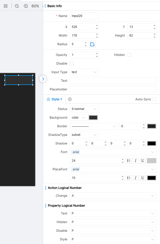
Input type properties of input box component are divided into text, password and text field. Prompt text can be set for all three types, and default text can be set for all types. The difference is that the input content of text type is plain text display, and carriage return is not supported; the input content of password type is replaced by solid dots; the text field type supports carriage return for line feed.
The IDE provides two status properties for Input Box components: 0-General and 1-Disabled.
Input box action logic number: change. When the user changes the text in the input box, both adding and deleting text triggers the change action.
Input box attributes logical numbering: Text, Hidden, Disabled, Style.
Select
All configurable properties of the select are shown in the figure:
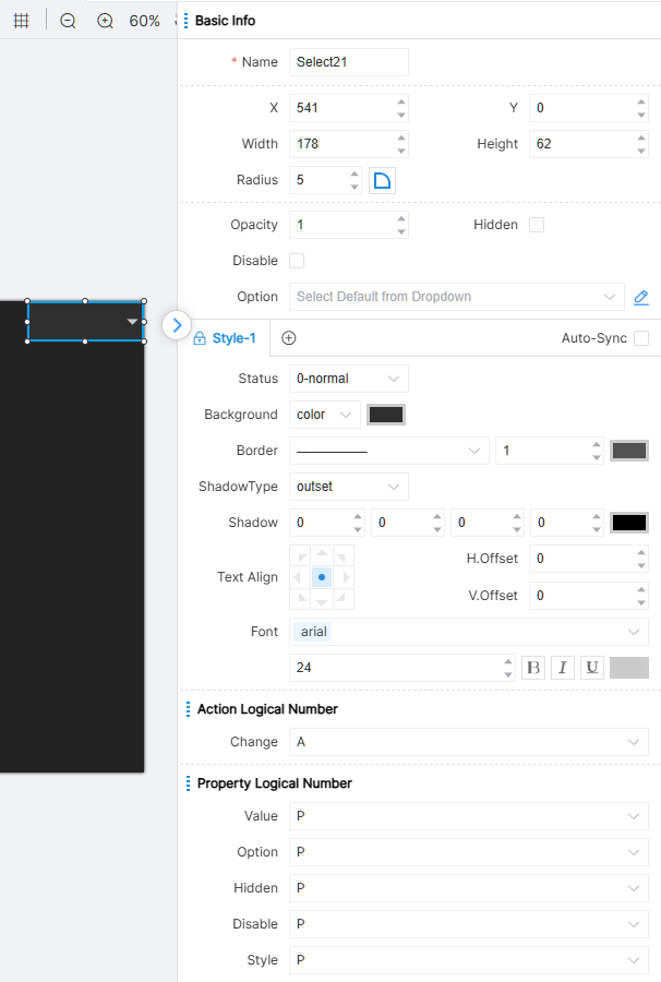
During runtime, the dropdown presents the predefined options configured by the engineer for user selection.
The IDE provides two state attributes for the Select component: 0-normal and 1-disable.
Select action logical number: Change. When the user selects a value, the Change action will be triggered.
Select property logical number: Value, Option, Hidden, Disable, Style.
Images
All configurable properties of the Images are shown in the figure:
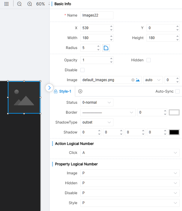
Images can display local or online images set by the engineer, providing richer content for the page.
The IDE provides one state attribute for the Images component: 0-normal.
Images action logical number: Click.
Images property logical number: Image, Hidden, Disable, Style.
Page Layout
The width and height of the page are related to the central controller model set when creating the project. For example, the PT-CON-TP40-HD page size is 720×720. After setting, you can view the page layout rendered on the device through the preview icon in the toolbar.
If you need to view partial details or view the layout of components as a whole, you can zoom in and out of the page by zooming in icon and zoom out icon. The percentage on the right indicates the current zoom in and out ratio. You can quickly restore the page size to 100% by the Reset zoom icon.
When the engineer drags each component in the page, the page will have a guide line for component alignment, and the engineer can also click on the page grid icon in the toolbar for more precise operation. The grid effect is as shown in the figure:
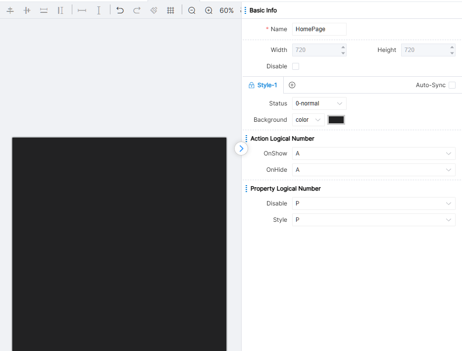
Below are some basic operations for layout, and placement/addition/deletion of components on a page.
Add Component
Use the mouse to select a component in the component library, hold down the mouse, and then drag it onto the canvas. Once you find the appropriate location on the canvas, release the mouse to complete the component addition.
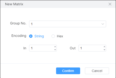
The addition of matrices is special. Drag the matrix to the canvas and a window will pop up to confirm the relevant parameters, as shown in the figure:
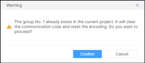
[Group Number]: The matrix consists of multiple inputs and outputs, and this number indicates that they belong to the same matrix group. [Communication Code]: Format of communication code. [Input]: Number of inputs of the matrix. [Output]: Number of outputs of the matrix. Click [OK] to add a matrix component. When the selected group number already exists, a prompt will pop up and merge with the existing group number matrix. As shown in the figure:
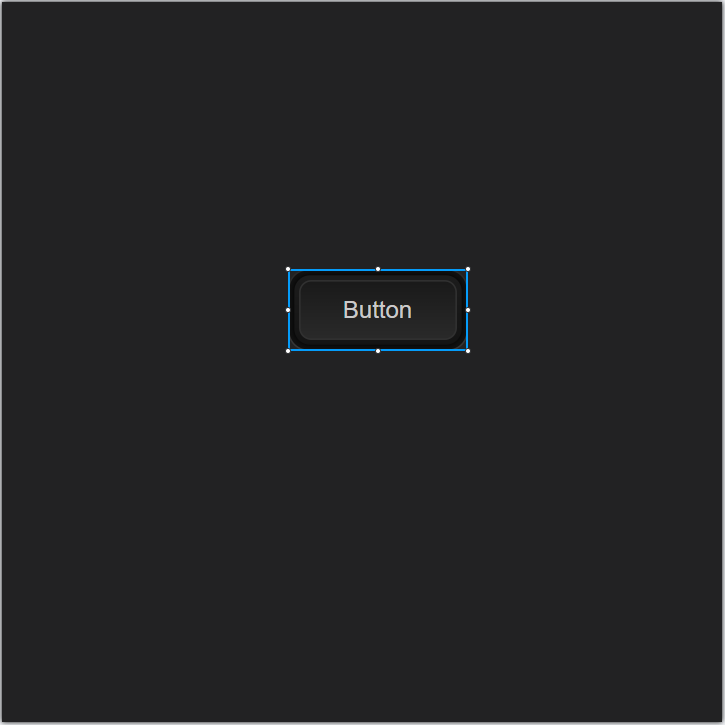
The added component has a stretchable border as the selected identifier, and the current attribute values of the component are presented in the property window on the right. The style can be adjusted as needed.
Component Operations
Clicking on a component on the page allows engineers to adjust the size of the component by stretching its borders. Select the component and click the left button without releasing it. At this point, you can drag the component to any position on the page. Engineers can also select components and use keyboard directional keys to move them up, down, left, and right. Right click on the selected component and click on [Horizontal Center] and [Vertical Center] in the pop-up menu to quickly adjust the component to the horizontal and vertical center positions on the entire page.
During dragging, if multiple components overlap, it will be judged whether the component is displayed in the upper layer or the lower layer according to the attribute [Hierarchy] size. If the hierarchy value is large, it means that the component will be at the top layer of multiple components, and engineers can directly see the component through the interface. Otherwise, it is at the lowest level of multiple overlapping components. In addition, the IDE provides a way to quickly change this hierarchy. Right click on the selected component, and in the pop-up menu, you can quickly move the hierarchy among a group of overlapping components through the options of [Top] and [Bottom]. At this time, their attribute hierarchy values will automatically change accordingly.
Select the component, right-click on the menu, click [Delete], or use the shortcut keys Ctrl+D / Delete to delete the selected component.
Select a component and hold down the Shift key to achieve proportional scaling of multiple selected components.
In addition, the IDE provides commonly used shortcut keys: Ctrl+C represents copying a component, Ctrl+X represents cutting a component, Ctrl+V represents pasting a component, and Ctrl+Z represents undoing. If you undo multiple times, you can use Ctrl+Y to restore the previously undone operation.
Group Operations
Group operations represent simultaneously manipulating multiple components.
Hold down the left mouse button in the blank area on the page, drag the mouse to the lower right will appear a light-colored rectangular box:
Find the appropriate location, fully incorporate multiple components into the rectangular box, release the left mouse button, and select the covered components simultaneously. At this time, the selected multiple components are within one operation box. You can also select the desired components one by one by holding down the keyboard Ctrl key and using the left mouse button.
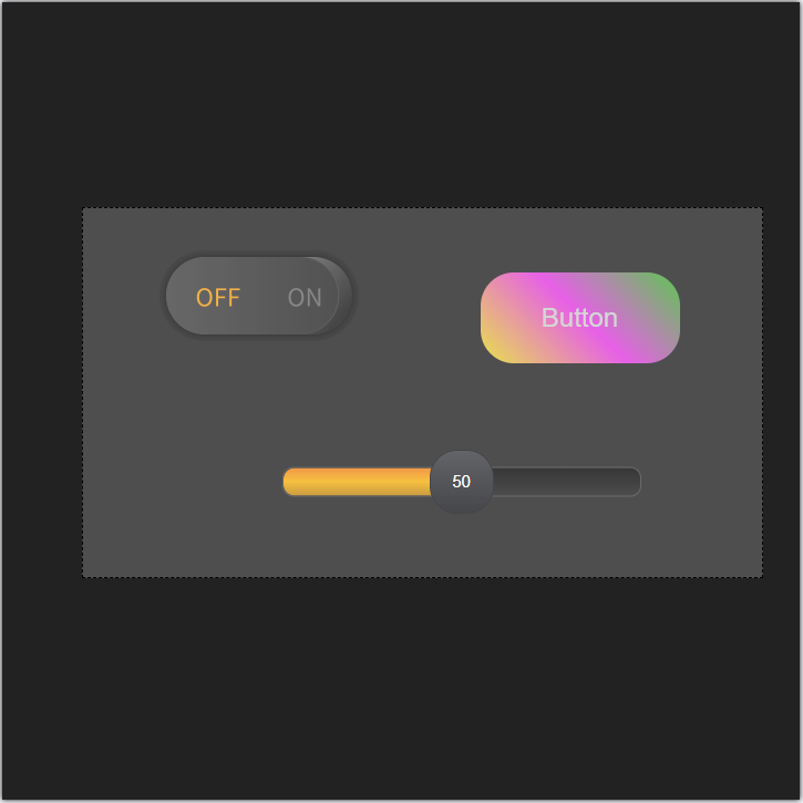
In the operation box, right-click the mouse and select [Combination] from the menu or use the shortcut Ctrl+G to fix the group components into a group and perform group operations:
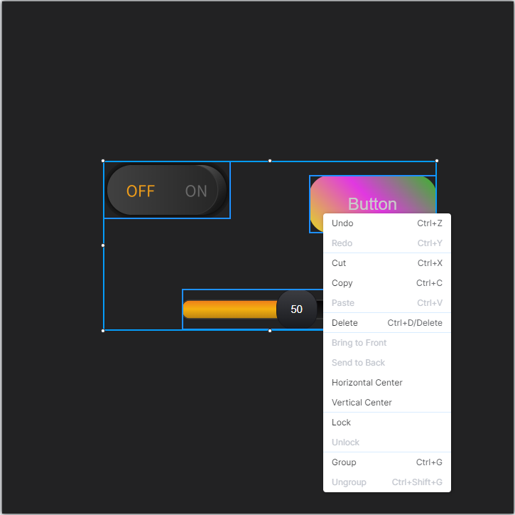
You can perform group operations as a whole, such as stretching, dragging, copying, cutting, pasting, level adjustment, centering, etc. These operations can be done either through the right-click menu or through the corresponding shortcut keys.
Under Group operation, hold down Shift key to zoom in/out multiple selected groups/components equally.
If you need to cancel this group operation, you can right-click the operation box area and select [Remove Group] in the pop-up option menu or use Ctrl+Shift+G to realize it.
Quick Alignment
The toolbar provides a set of buttons for quick position adjustment, as shown in the figure:
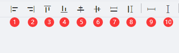
Note: Quick alignment provided by the IDE is a group operation based on the last component added to the page or the last selected component.
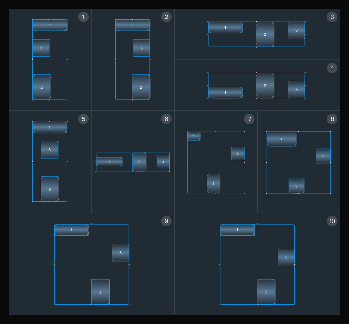
- Button ① aligns with the left border of the benchmark component.
- Button ② aligns with the right border of the benchmark component.
- Button ③ aligns with the top border of the benchmark component.
- Button ④ aligns with the bottom border of the benchmark component.
- Button ⑤ centers it vertically with the benchmark component.
- Button ⑥ centers it horizontally with the benchmark component.
- Button ⑦ uses the width of the benchmark component as the standard; all other components in the group will be adjusted to that width.
- Button ⑧ uses the height of the benchmark component as the standard; all other components in the group will be adjusted to that height.
- Button ⑨ adjusts the horizontal spacing between components to be equal.
- Button ⑩ adjusts the vertical spacing between components to be equal.
Keypad
This section mainly describes PT-CON-TP60RE panel buttons, including buttons, knob and knob toggle.
The panel interface follows the controller model, and the following is the configuration interface of PT-CON-TP60RE:
Button Property Settings
Open the PT-CON-TP60RE Settings page, the first button will be automatically selected, and the properties of the component can be seen on the right side, as shown in the red box area in the figure.
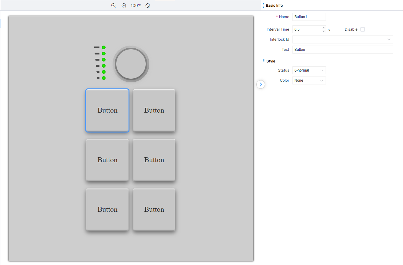
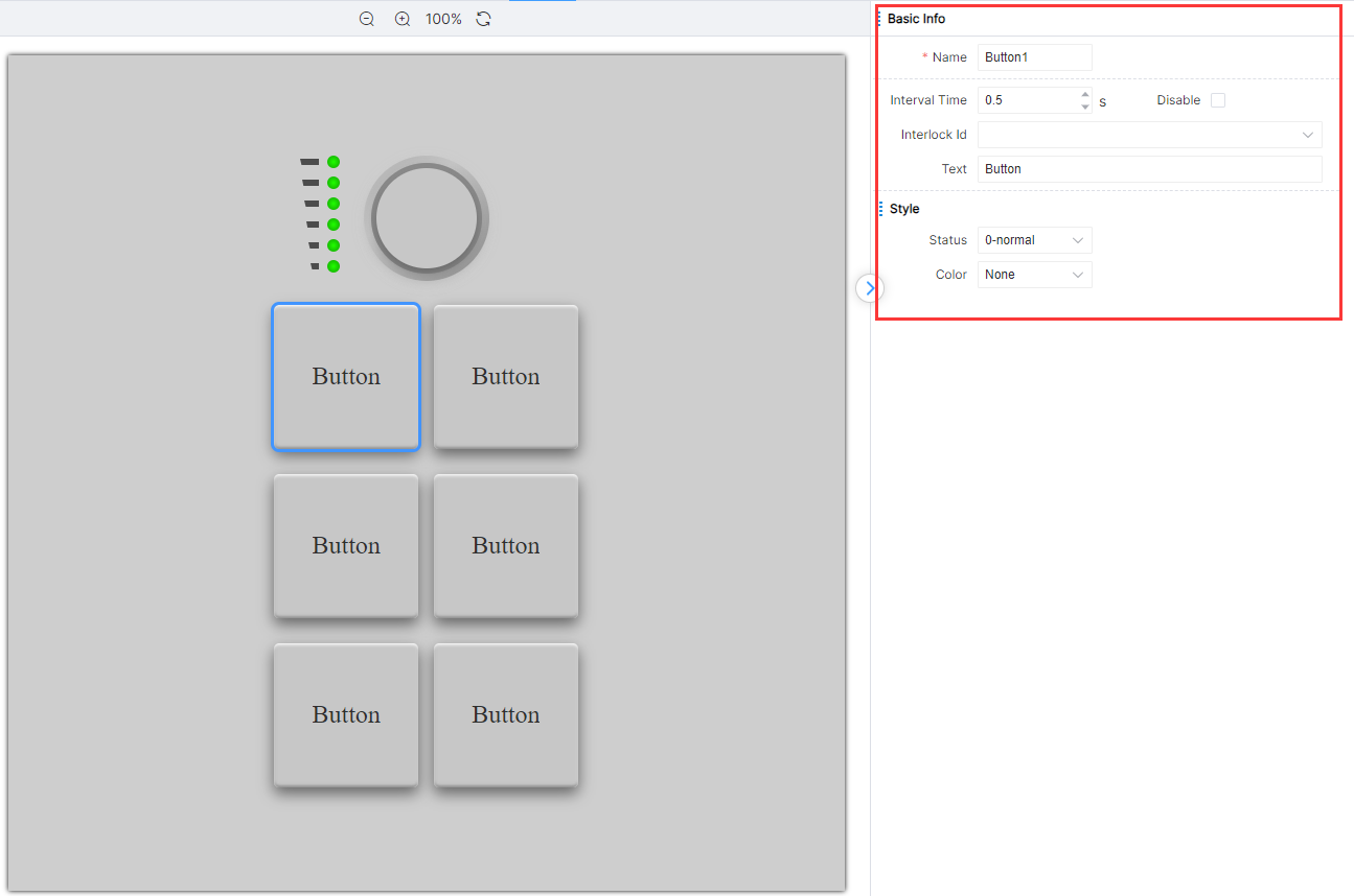
Basic Information Settings
Button properties are different due to button type differences, but each button contains a batch of properties with the same name and meaning. This part of properties belongs to basic information. The basic information is shown in the table below:
Style Settings
The button can change its light color by adjusting the value of the style property. The buttons change the lighting according to the operation logic during the operation process, and these lights can be changed through the [Status] property. For example, the button mode component of the button has three states: [Normal], [Active], and [Disabled], as shown in the figure:
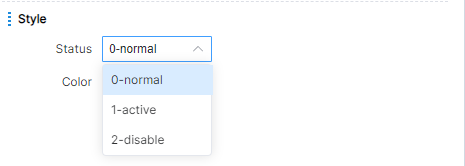
Button Type
There are three types of buttons on the button panel: buttons, knob, and knob toggle. It contains 6 buttons, 1 knob and 1 knob toggle.
Button
Button configurations in the button panel are similar to those in the UI Designer.
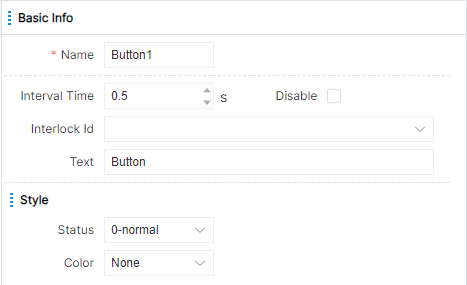
The interval time property is used to describe the interval time when the system triggers the long press action when the button is pressed for a long time. That is, when the user clicks the button and the system determines that it is a long press (pressing for more than 1 second), the long press event is triggered for the first time, and then the system executes a long press event every other time. The default interval given by the system is 0.5 seconds.
The IDE provides three state properties for button components: 0-General, 1-Active, and 2-Disabled, each corresponding to a different light.
Operating the buttons on the button panel can trigger the subsequent logic of pressing, long pressing and releasing the corresponding buttons in the PT-CON-TP60RE logic module. It is also possible to set the state of the corresponding button through the PT-CON-TP60RE logic module, or disable the property, so that it changes during operation.
Knob
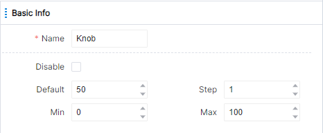
The knob configuration in the button panel is similar to the slider bar in the UI Designer. The properties that can be set are shown in the figure:
Minimum and maximum values represent the minimum and maximum values of the knob respectively. Stepping indicates how much clockwise rotation increases or how much counterclockwise rotation decreases, and continuous rotation triggers multiple changes.
When the user rotates the knob to modify the value, the subsequent logic of the knob change action in the PT-CON-TP60RE logic module will be triggered; when the user stops rotating 2 seconds, the subsequent logic of the knob release action in the PT-CON-TP60RE logic module will be triggered. The value of the knob can be set via the PT-CON-TP60RE logic module, or the property can be disabled.
Knob Toggle
The properties that can be set by the knob toggle in the button panel are shown in the figure:
Operating the knob toggle on the button panel can trigger the subsequent logic of the ON/OFF action of the corresponding knob toggle in the PT-CON-TP60RE logic module. It is also possible to set the value of the knob toggle and disable the attribute via the PT-CON-TP60RE logic module.
Logic Design
Add different types of logic modules to the canvas, establish the calling relationship between modules by dragging lines, and modify the parameter configuration of logic modules according to them.
The logical design is described in different areas, as shown in the figure:
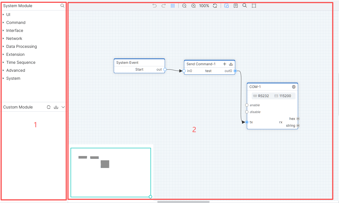
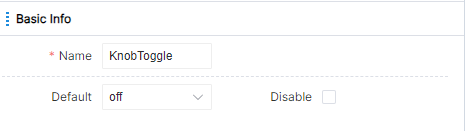
① [Module] area; ② Module design area.
Tool Bar
Click the Undo icon or the shortcut keys Ctrl+Z to undo the operation of the module, click the Resume icon or the shortcut keys Ctrl+Y to undo the operation just undone.
When the engineer drags each module in the page, the engineer can click the page grid icon in the toolbar to perform more refined operations. After adding the grid, the canvas is as shown in the figure:

Click the minimap icon, and a small map will be displayed in the lower left corner of the canvas. Engineers can quickly locate the required module range through the small map, as shown in the figure:
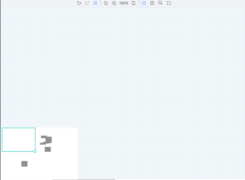
Click the global connection label switch icon, and all modules display the connection label edit box, as shown in the figure:
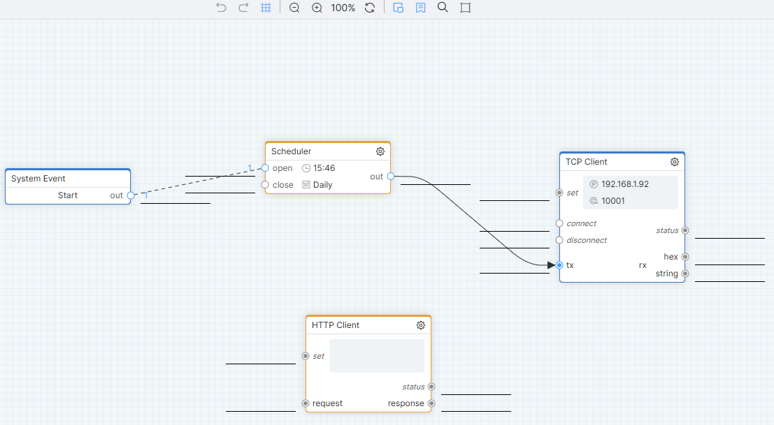
Click the search icon to perform a line label search.
Logic Module
Set action logic number and attribute logic number in page and component properties, associate with UI logic module, and establish calling relationship between different logic modules by connecting lines or editing connection labels. Therefore, the subsequent logic of the related logic module can be triggered when the terminal is operated, and the properties of the page or component can be modified through the logic module when the project is running.
Add Module
Drag a component in the module library with the mouse, find a suitable position on the canvas, and release the mouse to complete the addition of the module.
Connection Method
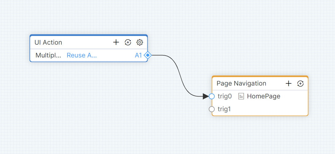
Call relationships between modules are established through wires. Move the cursor to the exit node of the module, press and drag for connection, press the space key for a long time to change the direction of the connection, move the arrow to the entry node of the target module to end the connection, the connection succeeds, the node turns blue, and the call relationship is established.
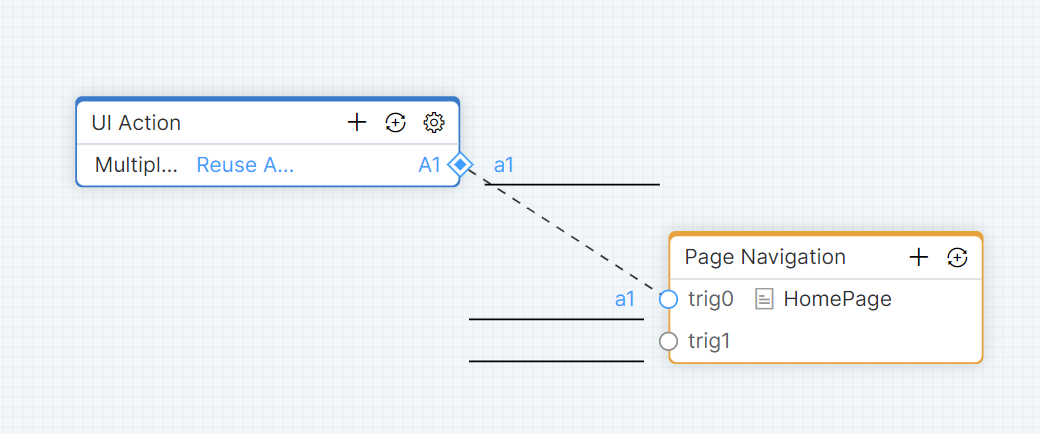
Call relationships between modules are established by connecting labels. When the module node connection labels are the same and the matching is successful, the node turns blue and the calling relationship is established.
Split Module
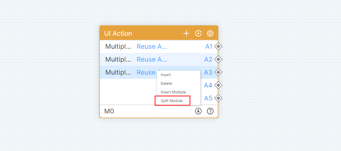
Select a module row, right-click and select [Split Module]. Split the module after selecting the row. The connection and connection label in the split module need to be retained. Drag module and the same module overlap when merged, merged modules in the line and line labels need to be retained.
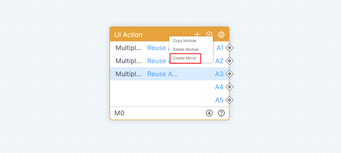
Create Mirror
Select the upper or lower area of the module, right-click and select [Create Mirror] to create a mirror module. The connection labels of each mirror module should be synchronized.
Cross-engineering Operation
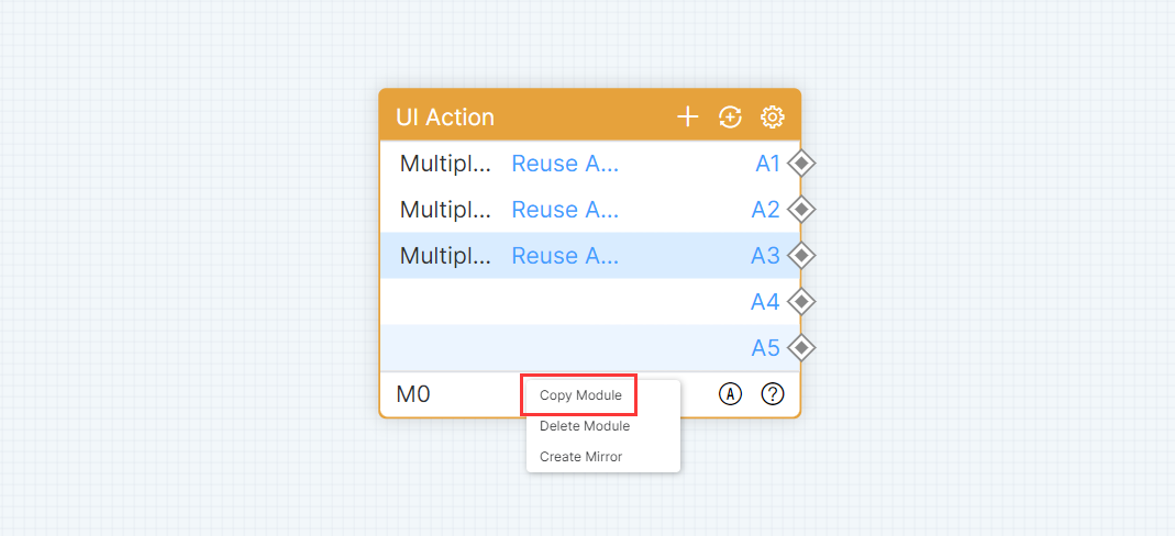
Copy and cut support cross-engineering operations. Select a single or multiple modules, right-click on [Copy Module] or Ctrl+C to copy the module in the upper or lower area of the module. Ctrl+X means cut module, Ctrl+V means paste module.
Select a single module or multiple modules and hold down the left mouse button to drag the module anywhere on the canvas. Module details list floating window, configuration floating window, can be freely dragged position. A logical introduction to the module can be found in the help floating window. Select a module, right-click [Delete Module] or use Ctrl+D / Delete to delete the selected module. Move the cursor in the canvas, hold down Ctrl key, and scroll the mouse up and down to zoom in/out on the canvas and module.
Logic Modules — UI
Note: When the equipment model of the central controller is PT-CON-TP60RE or PT-CON-TP80, the UI logic module is not displayed in the module library.
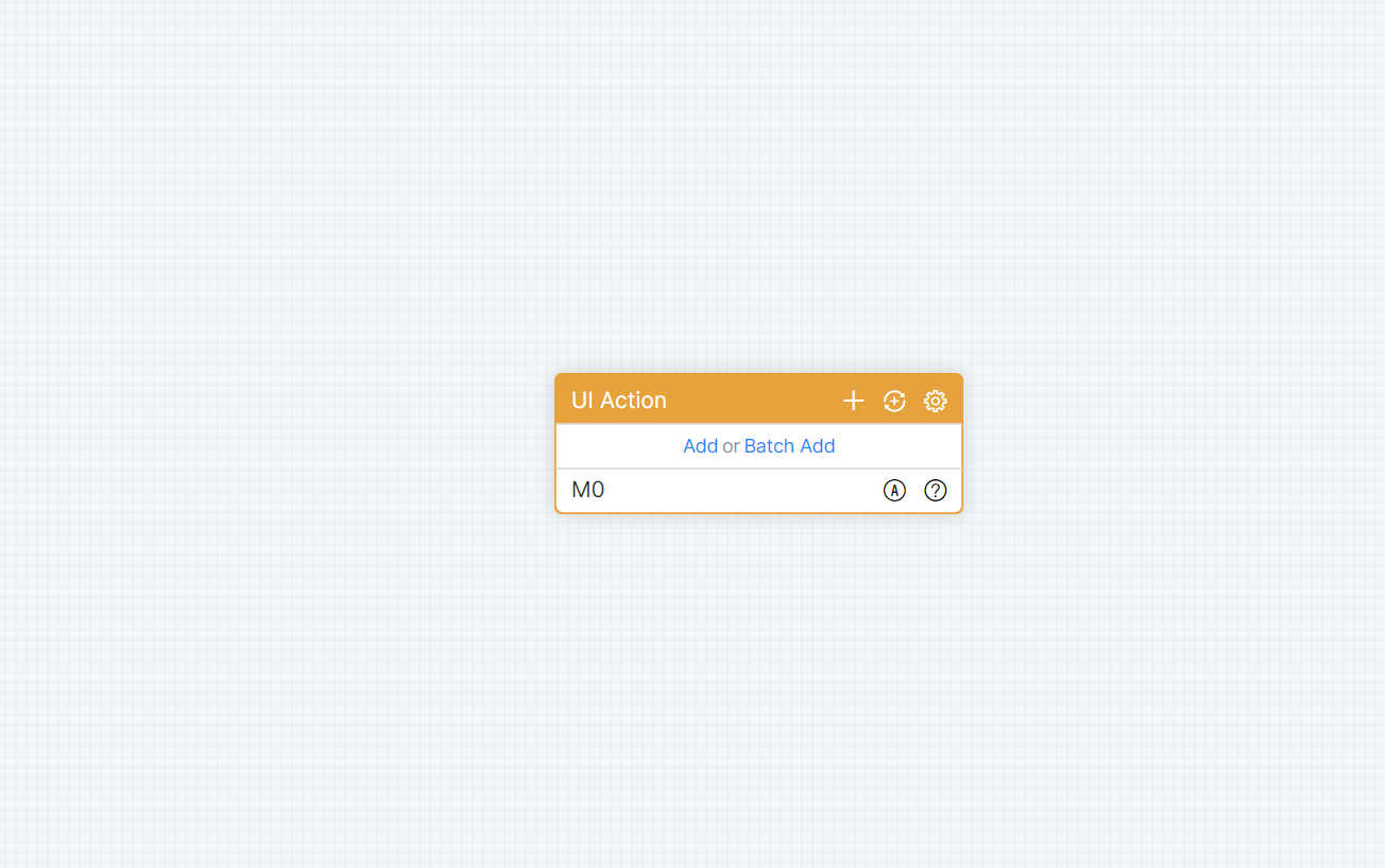
UI Action
Module name default display: UI action, can be modified. The initial state is as shown in the figure:
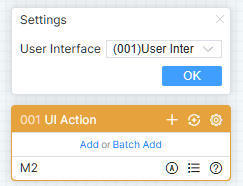
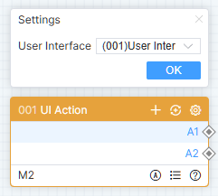
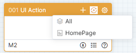
Click [Add] or [Batch Add] to add single or multiple pieces of data. Click on the add icon to add a piece of data at the end of the module. Right-click the module row menu, click [Insert] or [Insert Multiple Rows], and insert a single or multiple pieces of data below the selected row.
Click the synchronization icon to synchronize all pages, or only one page. After selecting, the logical number of actions not in this module will be added. As shown in the figure:
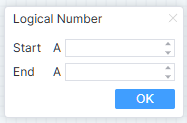
Click the configuration icon to pop up the configuration floating window, fill in the start number and end number, click [OK] to refresh the module. As shown in the figure:
Double-click the row to pop up the details list floating window to modify the comment information. As shown in the figure:
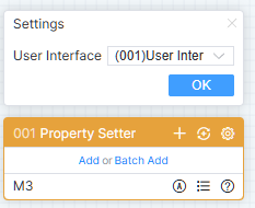
This module only has exit nodes. When the action logic number set in the page or component exists in the UI interaction module, terminal operations will trigger the subsequent logic of the corresponding action logic number exit node.
Property Setter
Module name default display: Property Setter. The initial state is as shown in the figure:
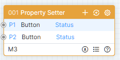
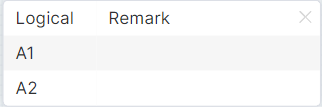
Click [Add] or [Batch Add] to add single or multiple pieces of data. Click the add icon to add a piece of data at the end of the module. Right-click the module row menu, click [Insert] or [Insert Multiple Rows] to insert a single or multiple pieces of data below the selected row.
Please refer to the UI interaction module for synchronization, configuration, details and other operations of the UI property module. This module only has entry nodes. When the logical attribute number set in the page or component exists in this module, triggering the entry node through a connection or connection label will change the corresponding property value.
Property Getter
Module name default display: Property Getter. The initial state is as shown in the figure:
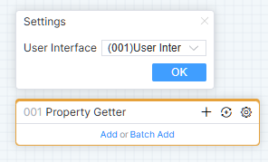
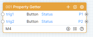
Click [Add] or [Batch Add] to add single or multiple pieces of data. Click the add icon to add a piece of data at the end of the module. Right-click the module row menu, click [Insert] or [Insert Multiple Rows] to insert a single or multiple pieces of data below the selected row.
Please refer to the UI interaction module for synchronization, configuration, details and other operations of the output UI property module. An entry node of the module corresponds to an exit node. When the logical attribute number set in the page or component exists in this module, trigger the entry node through a connection or connection label, then the corresponding exit node will output the current property value.
Page Navigation
Module name default display: Page Navigation. The initial state will automatically open the list of details, as shown in the figure:
If there is no row data, click [Add] or [Batch Add] to add single or multiple data. Click the add icon to add a piece of data at the end of the module. Right-click the module row menu, click [Insert] or [Insert Multiple Rows] to insert a single or multiple pieces of data below the selected row.
Click the synchronization icon to synchronize common pages and pop-ups in [UI Design]. Only add pages and pop-ups that have not been synchronized yet. Subpages need to be added manually.
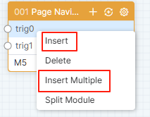
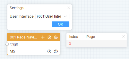
Double-click the row to pop up the details list floating window, you can configure the page, window, subpage. As shown in the figure:
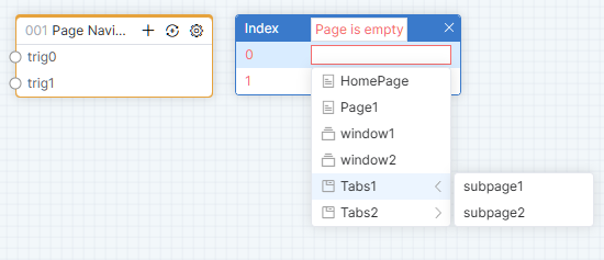
This module only has an entry node, which is triggered by a connection or connection label. When the user interacts, it will jump to the configured page, window, or subpage container will switch to the configured subpage.
Matrix
Module name default display: Matrix. The initial state will automatically open the configuration floating window, as shown in the figure:
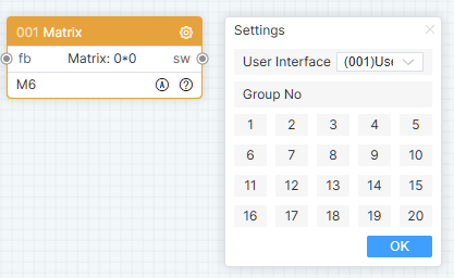
Click the configuration icon to pop up the configuration floating window, select the group number, and click [OK].
The feedback entry is triggered by a connection or a connection label, the data set is received (the first data is the input matrix communication code, and the second data is the output matrix communication code), and the corresponding relationship between input and output in the matrix group with the same group number is updated. When the user operates the matrix group at the terminal, the switching exit of the matrix module with the same group number is triggered, and the data set is output (the first data is the communication code of the current operation input matrix, and the second data is the communication code of the current operation output matrix).
Logic Modules — Panel
When the equipment model of the central controller is PT-CON-TP60RE or PT-CON-TP80, the panel-type logic module will be displayed in the module library.
PT-CON-TP60RE
Module name default display: PT-CON-TP60RE. The initial state is as shown in the figure:
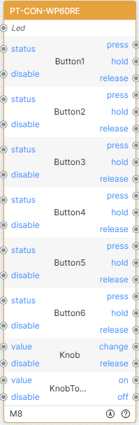
The module structure is fixed, including 6 buttons information, 1 knob information, 1 knob toggle information. Each button has 2 entry nodes: status, disable, and 3 exit nodes: press, hold, release; The knob has 2 entry nodes: value, disable, and 2 exit nodes: change, release; The knob toggle has 2 entry nodes: value, disable, and 2 exit nodes: on, off. Trigger the entry node through the connection or connection label to change the property value of the corresponding button. The user operates on the button panel to trigger the corresponding exit node of the module, thereby executing the subsequent logic.
PT-CON-TP80
Module name default display: PT-CON-TP80. The initial state is as shown in the figure:
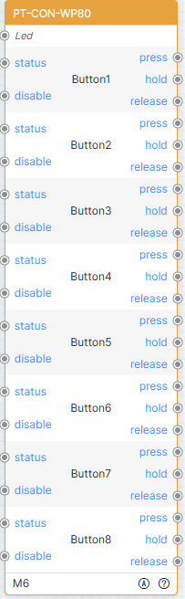
The module structure is fixed, with 8 buttons information. Each button message has 2 entry nodes: status, disabled, and 3 exit nodes: press, hold, and release. Trigger the entry node via a connection or connection label to change the property value of the corresponding button. The user operates on the button panel to trigger the corresponding exit node of the module, thereby executing the subsequent logic.
Logic Modules — Command
Mainly used to receive data, construct instructions and issue them.
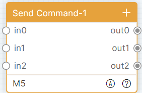
Command Send-1
Module name default display: Command Send-1. The initial state will open the detailed list as shown in the figure:

If there is no row data, click [Add] or [Batch Add] to add single or multiple data. Click the add icon to add a piece of data at the end of the module. Right-click the module row menu, click [Insert] or [Insert Multiple Rows] to insert a single or multiple pieces of data below the selected row.
Double-click the row to pop up the details list floating window, you can modify the commands and comments. As shown in the figure:
An entry node corresponds to an exit node for this module. The command can be configured with fixed command (for example, hello) or dynamic command (for example, how{0}you, {0} represents the received data). Use as a constant when a directive contains wildcards {*}. Hold down Ctrl and click the left mouse button to set the matching symbol {N} as a constant. When the command content is incorrect, it can be saved successfully, but the problem list will prompt an error or warning message.
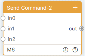
Command Send-2
Module name default display: Command Send-2. The initial state will open the detailed list as shown in the figure:

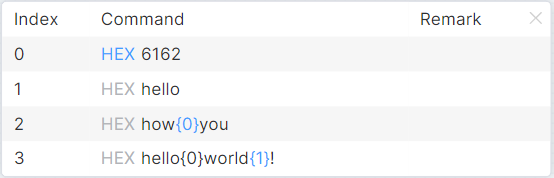
For Command Send-2 Module adding rows and details list operation, please refer to Command Send-1. The module has multiple entry nodes and an exit node from which all commands are output.
Serial Send Command
Module name default display: Serial Send Command. The initial state will open the detailed list as shown in the figure:


For Sequential Send Command Module adding rows and command configuration operation, please refer to Command Send-1. Double-click the line to pop up the details list floating window, you can modify the commands, delay, comments. As shown in the figure:
The module has one entry node and multiple exit nodes. After receiving the data, construct the command and output the command in sequence from top to bottom. If the delay time is configured, the corresponding delay time needs to be executed, and then continue to execute. When a command fails, the call is not interrupted and subsequent commands continue to be executed.
Logic Modules — Port
For different models of controller, the type and number of port modules are also different. For example, PT-CON-TP40-HD has only one COM-1 module; PT-CON-TP60RE has COM-1, COM-2, COM-3, COM-4, COM-5, IR-1, IR-2, IO-1, IO-2, relay-1 and relay-2 modules.
COM
Module name default display: COM-N. The initial state will automatically open the configuration floating window, as shown in the figure:
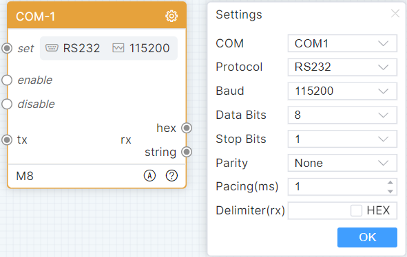
Click the configuration icon to pop up the configuration floating window, select port assignment, serial protocol, baud rate, data bit, stop bit, parity bit, fill in interval and separator, and click [OK].
Trigger the setting entry and dynamically set COM parameters according to the received data. This module is enabled by default, triggering disabled entry, unable to receive and send data. Trigger the send entry to send data to the controlled device. When the module receives data, it can output it in hexadecimal or string format.
IR
Module name default display: IR-N. The initial state will automatically open the configuration floating window, as shown in the figure:
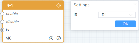
Click the configuration icon to pop up the configuration floating window, select port assignment, and click [OK].
This module is enabled by default, triggering disabled entry and unable to send data. Triggering the sending entry and sending infrared data in CCF code format to the controlled device.
IO
Module name default display: IO-N. The initial state will automatically open the configuration floating window as shown in the figure:
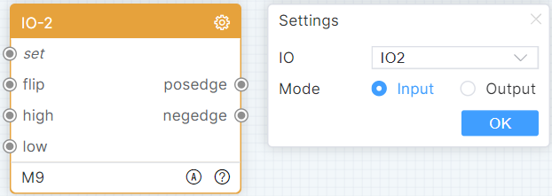
Click the configuration icon to pop up the configuration floating window, select port assignment and module, then click [OK].
Trigger the setting entry to dynamically set IO mode according to the received data. Trigger the flip entry, and change level. Trigger the high entry, set to high. Trigger the low entry, set to low. The module receives a rising edge message output 1 and a falling edge message output 0.
Relay
Module name default display: Relay-N. The initial state will automatically open the configuration floating window as shown in the figure:
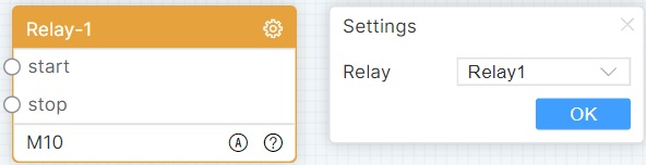
Click the configuration icon to pop up the configuration floating window, select port assignment, and click [OK].
Trigger to open the entrance and control the relay to turn on. Trigger to close the entrance and control the relay to turn off.
TCP Client
Module name default display: TCP Client. The initial state will open the configuration floating window as shown in the figure:
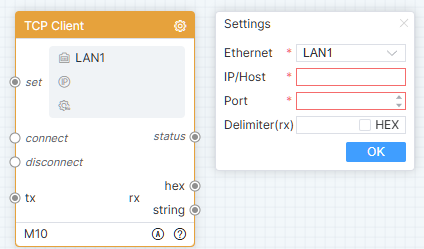
Click the configuration icon to pop up the configuration floating window, select the Ethernet, fill in the IP/Host, port and separator, then click [OK].
Trigger the setting entry to dynamically set TCP client communication parameters according to the received data. The module automatically establishes a connection by default, trigger a disconnection entry, and disconnects. Trigger the sending entry to send data to the controlled device. Output status information when connection changes occur. When the module receives data, it can output it in hexadecimal or string format.
TCP Server
Module name default display: TCP Server. The initial state will automatically open the configuration floating window, as shown in the figure:
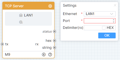
Click the configuration icon to pop up the configuration floating window, select the Ethernet, fill in the port and separator, then click [OK].
Trigger the send entry to send data to the controlled device. Output status information when connection changes. When the module receives data, it can output it in hexadecimal or string format.
UDP Client
Module name default display: UDP Client. The initial state will automatically open the configuration floating window, as shown in the figure:
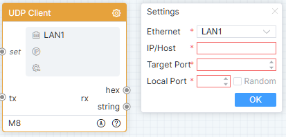
Click the configuration icon to pop up the configuration floating window, select the Ethernet, fill in the IP/Host, target port and local port, then click [OK].
Trigger the setting entry to dynamically set UDP client communication parameters according to the received data. Trigger the sending entry to send data to the controlled device. When the module receives data, it can output it in hexadecimal or string format.
UDP Server
Module name default display: UDP Server. The initial state will automatically open the configuration floating window, as shown in the figure:
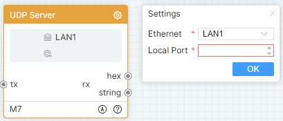
Click the configuration icon to pop up the configuration floating window, select the Ethernet, fill in the local port, then click [OK].
Before sending data for the first time, the client needs to send data once before triggering the sending entry to send data to the controlled device. When the module receives data, it can output it in hexadecimal or string format.
Websocket Client
Module name default display: Websocket Client. The initial state will automatically open the configuration floating window, as shown in the figure:
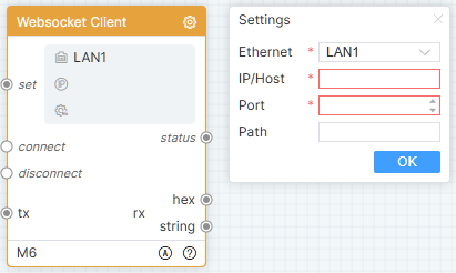
Click the configuration icon to pop up the configuration floating window, select the Ethernet, fill in the IP/Host, port and local path, then click [OK].
Trigger the setting entry, dynamically set the Websocket client communication parameters according to the received data. The module automatically establishes a connection by default, triggers a disconnection entry, and disconnects. Automatic reconnection when connection is abnormally disconnected. Trigger the sending entry to send data to the controlled device. Output status information when connection changes. When the module receives data, it can output it in hexadecimal or string format.
Http Client
Module name default display: Http Client. The initial state will automatically open the configuration floating window, as shown in the figure:
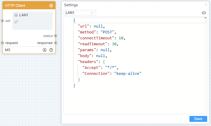
Click the configuration icon to pop up the configuration floating window, fill in the parameter values, then click [Save].
Trigger the setting entry to dynamically set Http client communication parameters based on the received data. Trigger the request entry to send data to the HTTP server. Output status code when communicating. Output response data as a string.
Telnet Client
Module name default display: Telnet Client. The initial state will open the configuration floating window as shown in the figure:
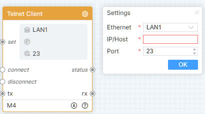
Click the configuration icon to pop up the configuration floating window, select the Ethernet, fill in the IP/Host and port, then click [OK].
Trigger the setting entry to dynamically set Telnet client communication parameters according to the received data. The module automatically establishes a connection by default, trigger a disconnection entry, and disconnects. Trigger the sending entry to send data to the controlled device. Output status information when connection changes occur. When the module receives data, it can output it in string format.
SSH Client
Module name default display: SSH Client. The initial state will open the configuration floating window as shown in the figure:
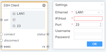
Click the configuration icon to pop up the configuration floating window, select the Ethernet, fill in the IP/Host, port, username and password then click [OK].
Trigger the setting entry to dynamically set SSH client communication parameters according to the received data. The module automatically establishes a connection by default, trigger a disconnection entry, and disconnects. Trigger the sending entry to send data to the controlled device. Output status information when connection changes occur. When the module receives data, it can output it in string format.
Ping
Default module name: Ping. In the initial state, the configuration pop-up window opens automatically, as shown in the figure:
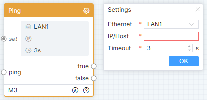
Click the configuration icon to pop up the configuration window. Select Ethernet, fill in IP/Host and Timeout, then click [OK].
Trigger the set input to dynamically configure the Ping communication parameters based on the received data. Trigger the ping input: if the ping succeeds within the interval time, True is triggered and the subsequent logic is executed; if the ping fails within the interval time, False is triggered and the subsequent logic is executed.
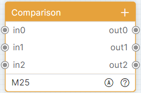
Comparison
Module name default display: Comparison. The initial state will automatically open the configuration floating window, as shown in the figure:

If there is no data, click [Add] or [Batch Add] to add single or multiple rows of data. Click the add icon to add a row of data at the end of the module. Right-click the module row menu, click [Insert] or [Insert Multiple Rows] to insert a single or multiple rows of data below the selected row.
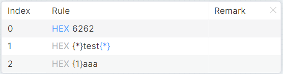
Double-click the row to pop up the details list floating window, and you can modify the matching rules and comments. As shown in the figure:
An entry node of this module corresponds to an exit node. The matching rule can be a fixed value (for example: hello) or an expression (for example: hello{*}). Only wildcards can be used in the expression. Using {N} will only be regarded as a constant. Hold down Ctrl and click the left mouse button to set wildcard characters as constants. Match the received data with the matching rule, and if the match succeeds, the received data will be output, and if the match fails, no output will be made.
String Joiner
Module name default display: String Joiner. The initial state will automatically open the configuration floating window, as shown in the figure:

This module will have at least one row of data. Click the add icon to add a row at the end of the module. Right-click the module row menu, click [Insert] or [Insert Multiple Rows] to insert a single or multiple rows of data below the selected row.
Double-click the line to pop up the details list floating window, you can set the parameter type, when it is a parameter, the constant value is grayed out, and the line has an entry node; when it is a constant, the constant value can be modified, and the line has no entry node.
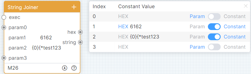
Constant values are used only as constants when there are matching characters in them. When the execution entry is triggered, the module assembles parameters from top to bottom and outputs them in hexadecimal or string format.
Buffer
Module name default display: Buffer. The initial state will automatically open the configuration floating window, as shown in the figure:

This module will have at least one row of data. Click the add icon to add a row at the end of the module. Right-click the module row menu, click [Insert] or [Insert Multiple Rows] to insert a single or multiple rows of data below the selected row.
Double-click the row to pop up the details list floating window, you can modify the initial value and comments.
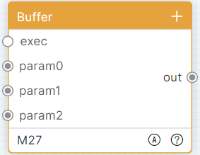
When there is a match in the initial value, it is only used as a constant. When triggering parameter entry, receive and update corresponding cache data. When an execution entry is triggered, the module assembles a data set from top to bottom and outputs the data set.
Matcher-1
Module name default display: Matcher-1. The initial state will automatically open the configuration floating window, as shown in the figure:
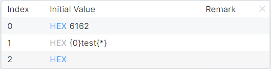
If there is no data, click [Add] or [Batch Add] to add single or multiple rows of data. Click the add icon to add a row at the end of the module. Right-click the module row menu, click [Insert] or [Insert Multiple Rows] to insert a single or multiple rows of data below the selected row.
Double-click the row to pop up the details list floating window, and you can modify the matching rules and comments.
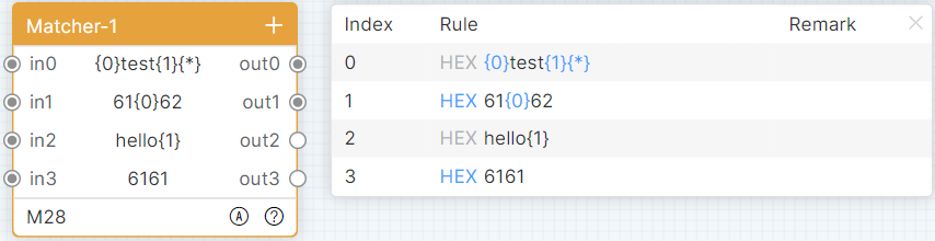

An entry node of this module corresponds to an exit node. The matching rule can be a fixed value (for example: hello) or an expression (for example: hello{0}). {N} in the expression must start from 0 and cannot be repeated. {*} can be repeated. Trigger an entry to extract data from received data according to a matching rule, and output no data if no data is extracted; extract one piece of data and output the data; extract multiple pieces of data and output a data set.
Matcher-2
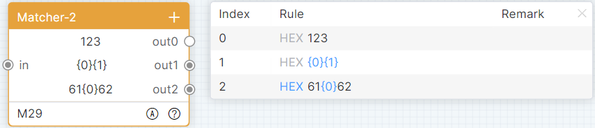
Module name default display: Matcher-2. The initial state will automatically open the configuration floating window, as shown in the figure:

Refer to Matcher-1 for adding rows and detail lists in the Matcher-2 module.
The module has one entry node and several exit nodes. Trigger an entry port to extract the received data with multiple matching rules, thereby extract different data.
Data Splitter
Module name default display: Data Splitter. The initial state is as shown in the figure:
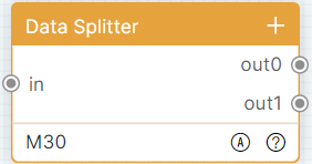
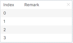
Refer to Matcher-1 for adding rows to this module. Double-click the row to pop up the details list floating window, you can modify the remarks.
The module has one entry node and several exit nodes. Trigger the entry port to split the received data set into multiple parameters and output.
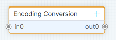
Encoding Conversion
Module name default display: Encoding Conversion. The initial state is as shown in the figure:
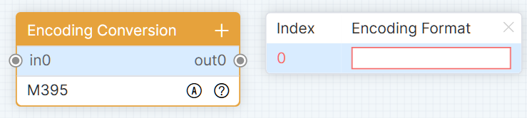
Refer to Matcher-1 for adding rows to this module. Double-click the row to pop up the details list floating window, you can modify the encoding format.
An entry node corresponds to an exit node for this module. Trigger the entry point, process the data into corresponding encoding and output.
Logic Modules — Extend
Interlock
Module name default display: Interlock. The initial state is as shown in the figure:
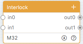
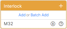
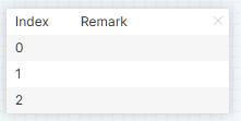
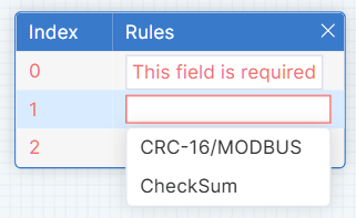
If there is no data, click [Add] or [Batch Add] to add single or multiple rows of data. Click the add icon to add a row at the end of the module. Right-click the module row menu, click [Insert] or [Insert Multiple Rows] to insert a single or multiple rows of data below the selected row.
Double-click the row to pop up the details list floating window, you can modify the storage name (supports input and selection to set the storage name in the storage module). As shown in the figure:
One entry node corresponds to one exit node in this module. Trigger any entry node, corresponding to output 1 at the exit, and output 0 at the other exits.
Toggle
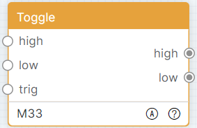
Module name default display: Toggle. The initial state is as shown in the figure:
Trigger the high entry, set the state to high and outputs 1. Trigger the low entry, set the state to low and output 0. Trigger the [Trigger] entry, change the current state and output. For example: the module default state is low, directly trigger the [trigger] entry, set the state to high and output 1.
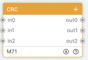
CRC
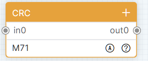
Module name default display: CRC. The initial state will open the detailed list as shown in the figure:
If there is no data, click [Add] or [Batch Add] to add single or multiple rows of data. Click the add icon to add a row at the end of the module. Right-click the module row menu, click [Insert] or [Insert Multiple Rows] to insert a single or multiple rows of data below the selected row.
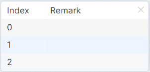
Double-click the row to pop up the details list floating window, you can modify the storage name (supports input and selection to set the storage name in the storage module). As shown in the figure:
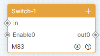
Switch-1
The module name is displayed as "Switcher-1" by default, as shown in the figure.
This module will contain at least one row of data. Click the add icon to add a new row at the end of the module. In the module row context menu, click [Insert] or [Insert Multiple Rows] to insert one or more rows of data below the selected row.
Double-click a row to open the details popup window, where you can edit the remarks.
All nodes of Switcher-1 are initially in a disabled state. The module does not perform any processing on the data. Data enters from in endpoint and the raw data is output through all enabled output ports.
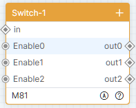
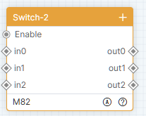
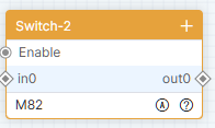
Switch-2
The module name is displayed as "Switcher-2" by default, as shown in the figure.
This module will contain at least one row of data. Click the add icon to add a new row at the end of the module. In the module row context menu, click [Insert] or [Insert Multiple Rows] to insert one or more rows of data below the selected row.
Double-click a row to open the details popup window, where you can edit the remarks.
Switcher-2 is initially in a disabled state. The module does not perform any processing on the data. When enabled, triggering the in endpoint outputs the raw data through the corresponding row output port.
Logic Modules — Time Sequence
Delay
Module name default display: Delay. The initial state will open the detailed list as shown in the figure:
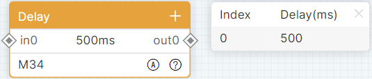
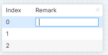
If there is no data, click [Add] or [Batch Add] to add single or multiple rows of data. Click the add icon to add a row at the end of the module. Right-click the module row menu, click [Insert] or [Insert Multiple Rows] to insert a single or multiple rows of data below the selected row.
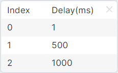
Double-click the row to pop up the details list floating window, you can modify the storage name (supports input and selection to set the storage name in the storage module). As shown in the figure:
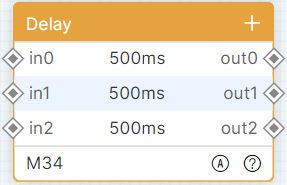
The module does not do any processing to the data, triggers the input port, executes the delay of the corresponding row, and outputs the original data from the corresponding row outlet.
Timer
Module name default display: Timer. The initial state will automatically open the configuration floating window, as shown in the figure:
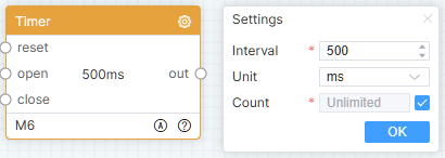
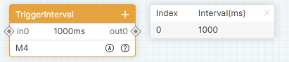
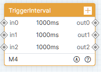
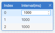
Click the configuration icon to pop up the configuration floating window, fill in the interval time, select the time unit, and click [OK].
The module is closed by default, trigger to open the entry, periodically execute the subsequent logic of the outlet, trigger to close the entry, and close the timer.
Scheduler
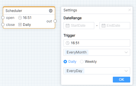
The module name is displayed as "Scheduler" by default. The configuration popup window will automatically open in the initial state, as shown in the figure:
Click the configuration icon to open the configuration popup, fill in the settings, and then click the [OK] button.
The module is disabled by default. Triggering the open endpoint periodically executes the subsequent logic at the output. Triggering the close endpoint disables the scheduler.
TriggerInterval
Default module name: TriggerInterval. In the initial state, the details list is opened, as shown in the figure:
When there is no data, click Add or Batch Add to add a single row or multiple rows of data. Click the add icon to add one row of data at the end of the module. In the right-click menu on a module row, click Insert or Insert Multiple to insert one or multiple rows of data below the selected row.
Double-click a row to pop up the details list window, where the interval time can be modified.
The module does not process the data in any way; it only performs interval time checks. Once the interval time requirement is met, the original data is output from the corresponding endpoint.
Operation
Module name default display: Operation. The initial state is as shown in the figure:
This module will have at least one row of data. Click the add icon to add a row at the end of the module. Right-click the module row menu, click [Insert] or [Insert Multiple Rows] to insert a single or multiple rows of data below the selected row.
Double-click the row to pop up the details list floating window, you can modify the storage name (supports input and selection to set the storage name in the storage module). As shown in the figure:
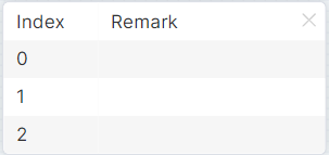
Click the configuration icon to pop up the configuration floating window, select the operation mode, fill in the operation logic, and click [OK].
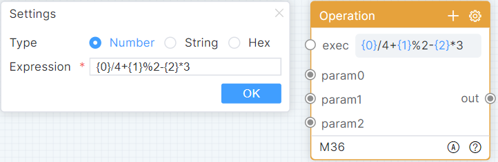
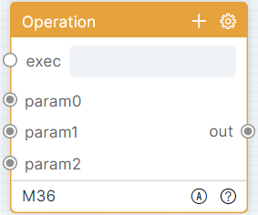
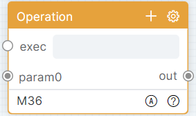
The module has multiple entry nodes and one exit node. Trigger parameter entry to receive and update cache data. Trigger execution entry, perform operation according to operation logic expression, and output operation result.
Logic Decision
Module name default display: Logical Decision. The initial state is as shown in the figure:
This module will have at least one row of data. Click the add icon to add a row at the end of the module. Right-click the module row menu, click [Insert] or [Insert Multiple Rows] to insert a single or multiple rows of data below the selected row.
Refer to Operation for the module details list operations. Click the configuration icon to pop up the configuration floating window, select the operation mode, fill in the operation logic, and click [OK].
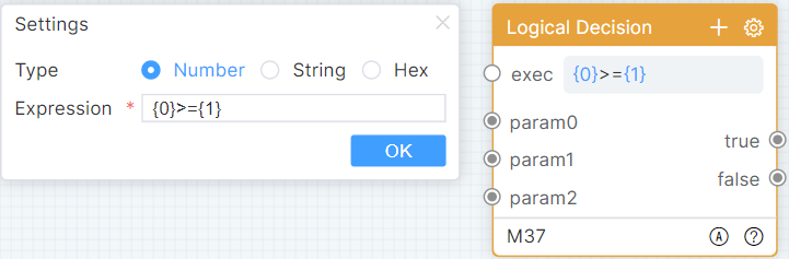
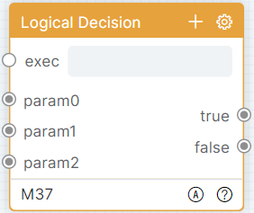
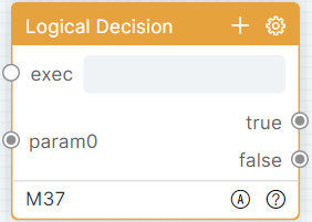
Trigger parameter entry to receive and update cache data. Trigger the execution entry, judge the operation according to the judgment logic expression, and output the data set (the first data is the expression result, 1 is true, 0 is false. Then parameter 0–parameter N received data).
Function
Module name default display: Function. The initial state is as shown in the figure:
If there is no data, click [Add] or [Batch Add] to add single or multiple rows of data. Click the add icon to add a row at the end of the module. Right-click the module row menu, click [Insert] or [Insert Multiple Rows] to insert a single or multiple rows of data below the selected row.
Refer to Operation for the module details list operations. Click the configuration icon to pop up the configuration floating window, write custom functions in JavaScript script language, and click the [Save] button.
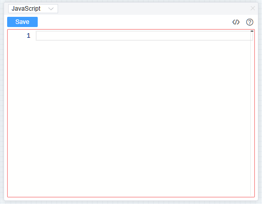
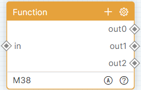
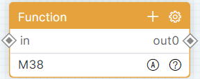
The module can use built-in functions: params is a string array of input parameters, params[0] indicates the first parameter; $Log(message) prints the contents to the console; $TriggerOutString(int, string) outputs data in string format, int indicates the [out] sequence number; $TriggerOutHex(int, string) outputs data in hexadecimal format. The module has one entry node and multiple exit nodes. Trigger an entry port, receive data and execute a function, with the output specified by the function logic. The module exit is wired, but does not use $TriggerOutString or $TriggerOutHex to output data, so the exit will not output data and will not execute subsequent logic.
Storage Setter
Module name default display: Storage Setter. The initial state will open the detailed list as shown in the figure:

If there is no data, click [Add] or [Batch Add] to add single or multiple rows of data. Click the add icon to add a row at the end of the module. Right-click the module row menu, click [Insert] or [Insert Multiple Rows] to insert a single or multiple rows of data below the selected row.
Double-click the row to pop up the details list floating window, you can modify the storage name and initial value. As shown in the figure:
Storage Getter
Module name default display: Storage Getter. The initial state will open the detailed list as shown in the figure:
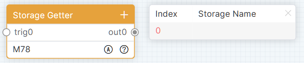
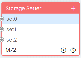
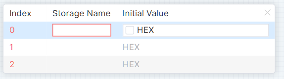
If there is no data, click [Add] or [Batch Add] to add single or multiple rows of data. Click the add icon to add a row at the end of the module. Right-click the module row menu, click [Insert] or [Insert Multiple Rows] to insert a single or multiple rows of data below the selected row.
Double-click the row to pop up the details list floating window, you can modify the storage name (supports input and selection to set the storage name in the storage module). As shown in the figure:
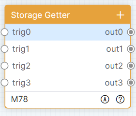
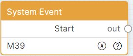
Logic Modules — System
System Events
Module name default display: System Events. The initial state is as shown in the figure:
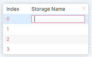
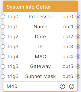
After the system starts successfully, immediately execute the subsequent logic of the module exit.
System Info Getter
Module name default display: System Info Getter. The initial state is as shown in the figure:
The module has 7 entry nodes and 7 exit nodes. Trigger [Trigger] 0–6 entries and [out] 0–6 entries to output the current system model, device alias, date, IP, MAC address, gateway and subnet mask.
Legal & Compliance
Product identification
Model: PL-IDE-SW – manual version V1
Warranty and liability
The manufacturer grants the full statutory warranty on all new devices. As the manufacturer has no influence on installation, the warranty only applies to the product itself. If you detect a fault or damage, please contact your dealer and provide your sales slip or invoice as proof of purchase.
The manufacturer is not liable for damage to persons or property caused by improper installation, operation or maintenance not described in this manual. Do not alter or modify the product or its accessories. Any use other than described in this manual is not permitted and voids warranty and guarantee.
Trademarks and disclaimer
Product model and logo are trademarks. All other company and product names mentioned are trademarks of their respective owners. All rights reserved. No part of this publication may be copied or reproduced without prior written permission. We reserve the right to make changes to the device, packaging or manual and accept no liability for misprints.
Packaging
Dispose of packaging separately by material (paper/cardboard, plastics) via the local collection systems. Keep packaging material away from children – risk of suffocation. Packaging register LUCID: DE5958616449295.